Pitch: An interactive news report on Haiti’s rebuilding process after the 2010 earthquake in Port-au-Prince. Client: self-produced. Platform: web.
Total production budget: around €26k. The Pixel Hunt’s tasks: game design, level design, scoring, project direction, project management.
Link:http://apps.rue89.com/haiti/en (French, English) Key facts: won an Online Jounalism Award for excellence in Explanatory Reporting, in the Small Newsroom category.
I used to be a journalist, then I took an arrow in the knee… and started working on my first “newsgame“. It was 7 years ago, and I was motivated by the feeling that journalism and video games had a lot to learn from each other.
On the one hand, journalism’s noble goal of turning the world into something understandable by everyone was very appealing to me. But we had trouble finding the best way to adapt to the digital age. My guess is we didn’t understand that a change of paradigm was at stake. Before the web, journalism was a matter of building linear discourses. We were thinking in a broadcast logic, from the issuer (the newspaper, TV or radio station) to the receivers (readers, viewers, listeners). But the Internet doesn’t work that way. It rather is an inherently interactive distribution channel. Therefore, we suddenly had to consider conveying news as a discussions rather than discourses.
On the other hand, I was fascinated by the self-explanatory nature of video games. Most of the time, you don’t really need tutorials to play a game – you understand it through experience. It is a naturally interactive media, with which players discuss to understand both what they are supposed to do and what the story being told is about. The first time you play Super Mario Bros, you are free to rush your Italian avatar straight into one of the pits that populate the level. Mario will die and you’ll have to start all over again, but thanks to this experience, you’ll update your knowledge of what you’re supposed to do. This is how discussions in games work: while interacting with an “operational reality”, players gradually acquire an ever-sharper perception of the rules that shape the world.
The world of Super Mario Bros. is all about mushroom-eating plumbers, aggressive turtles and obese dragons. And indeed, a lot of people (me included) praise games with fantastic universes, as they often are used as a way to leave reality behind for a moment. Gaming in itself is a very real experience, but most games don’t say much about the world around us – at least not in a direct fashion.
As a journalist, I thought using games as a media to help people understand real news and facts might also be a good idea. I didn’t think they would be the perfect fit for all news stories, of course. Yet sometimes, for instance when we were trying to describe systems – that is to say, situations that involved many actors with interlocked interests – we, journalists, could find games useful.
To build such games, the primary journalistic work remained unchanged: you still had to dissect a subject, to expose its inner logics, to understand the causes and consequences at stake. The only difference laid in the way this work would be communicated. Instead of telling “what is”, we had to create a machine that would show “what could be”. Our models would be simplified, of course, but they would work according to rules similar to what we had analysed of the real world. We would then challenge players to reach a certain goal, and by doing that, they would acquire a deep understanding of the system itself. There seemed to be a lot of possibilities that could prove very rewarding both for the journalists to make and the audience to play.
The specifics of “Newsgame design”
After a few years of practice, it turns out my initial intuitions are confirmed. Yes, video games are a great tool to tell stories differently. Yes, interactivity is sometimes far more efficient than linearity, for instance to underline causal links, explain how systems work or involve an audience. And for those who wonder: yes, creating such games is super complicated.
Why ? Because interactivity demands a bigger effort than linearity. An article doesn’t ask for much: plug in your brain, read the text, try to understand it. That’s sometimes hard, especially on Monday mornings, but it’s also pretty straightforward. Games are more challenging in the sense that they won’t let anything happen without you. If you do not interact with them, you will not understand a single thing.
Journalists willing to produce good newsgames therefore face two challenges:
Create a game design efficient enough to justify the required effort. Is the game’s challenge interesting enough for the audience to actually want to play it?
Make sure that the game actually transmits the relevant information. Will the player get the necessary facts at the appropriate time in order to make the proper logical connections?
These two challenges are neither new nor really specific to newsgames design. But playing with information is restrictive. For example, a game with a focus on entertainment can afford to be received differently by different types of players. One may enjoy Call of Duty regardless of one’s stance on the pro-US militaristic values the game carries. A newsgame, on the contrary, has editorial responsibility on its content. Similarly, fun in “classic” videogames often relies on excessive, over-the-top situations, when a newsgame theoretically must always remain realistic.
Does this mean that “news” and “games” are difficult to reconcile? I don’t think so. We live in a world of systems, as emphasized by Eric Zimmerman. We can’t fully explain the world anymore without proposing simplified, easier to understand versions of it for people to explore. Today’s digital journalist got that, because more and ore of them grew up playing video games – they are used to system-driven narration and slowly import it in newsrooms.
Now, The Pixel Hunt isn’t a news organization. We produced a couple newsgames as commissioned works in the past, but that isn’t our main activity. We don’t have a large enough audience to monetize short, free games through advertising, and we’re not a big enough team to provide people with rich and diverse news coverage. Newsrooms such as the NYT’s or Le Monde’s have the infrastructure for that, not us. And in any case, I’m not sure I’d enjoy producing games in a hurry – yet haste is needed should you want to keep your newsgames relevant.
Then again, since its inception, The Pixel Hunt has been producing video games that share one thing in common: a more or less direct connection with the world around us. The latest project we work on with Figs, Bury me, my Love, is 100% in line with this dynamic. So if those aren’t newsgames, what are they?
Yeah right, what are you guys doing?
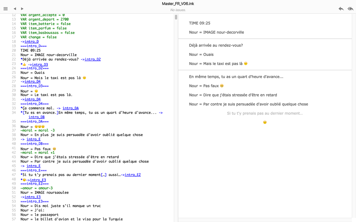
To answer this question, I’ll have to tell you a bit about The Pixel Hunt’s business model first. As a studio, we sometimes work for news organisations such as Le Monde or Libération, but our main clients are TV production companies. They contact us because they shot a documentary film and want to couple it with “a little something on the web”. They provide us with a lot of info on their documentary’s topic, and we design a game together. More often than not, the documentary and the game are aired simultaneously by one of France’s public network channels (mainly France Télévisions or Arte). Everyone may then watch the film and play the game for free, and even though they are often fairly independent, you get an even richer immersion in the topic if you do both.
So you may be tempted to say that we make documentary games. And you might find me annoyingly picky on semantics, but I beg to differ.
The problem with the name “documentary games” is that it directly refers to the documentary film, a linear storytelling form. Most of the time, a documentary is a “non-fiction” in which the author nonetheless subjectively describes a situation. It is built as a demonstration, as a way to take you from point A to point B. I am a big fan of documentary films, but I don’t think video games are suited for this endeavour – at least not with a similar method. Linear media and games just don’t work the same way. A game that wants to have a take on the real world should use the very essence of games to do so – not mimic films.
It’s funny that I found several quotes of game designers that helped me clarify my thoughts in… a documentary, Game Loading. I was happy to hear Nina Freeman (game designer of Cibele) call for more diversity in games stories – because there’s no topic games can’t talk about. I related to Ryan Green (author of That Dragon, Cancer) when he stated that designing a game about a real-world event made him see reality as a set of systems and mechanics. I shared Richard Hofmeier’s joy when he noticed that people making YouTube Let’s Plays about his Cart Life slowly evolved from mockery to empathy in the course of a playthrough. I saluted Christine Love when she explained that the most important part of her work as a game designer is to try to get people to see things from another perspective. I sided with Davey Wreden (co-author of The Stanley Parable) and his claim that facing complex, unusual scenarios in virtual environments helps us be stronger in the “real” world.
These testimonies helped me build a definition of the kind of games we, at TPH, want to make. I tried to phrase it through a series of rules they abide by.
They make a direct reference to the real world
They describe the world through a credible model of its mechanics
They allow the player to manipulate this model, and thus to see things through an unusual perspective
They differ from reality insofar as they allow for non-permanent consequence, thereby encouraging the player to fail and try again – and get better.
What we learn in those games sticks with us as real human beings
I propose the term “Reality-inspired games” to describe this genre. And even though they aren’t new (think The Oregon Trail), I’m under the impression that in recent years, we have seen more and more of those. Here is a small, subjective selection of recent titles that, to me, fit in this family.
Papers, Please – a game in which you play the role of an immigration officer in a clearly soviet-union-inspired world.
Firewatch – a game in which you play as Henry, a guy whose work is to watch a US national park for wildfires.
The Beginner’s Guide – a game in which someone has you playtesting a series of short games allegedly created by a mysterious artist he seems to be found of.
That Dragon, Cancer – a game about a child diagnosed with a brain tumor and the way he and his family cope with it.
Cibele – a game about falling in love with someone while playing a MMO in the late 2000’s.
Cart Life – a game about trying to make ends meet while living off petty jobs.
Her Story – a criminal investigation where you try to understand what happened by parsing videos of interviews of the prime suspect, the victim’s wife.
This war of mine – a war game in which you, for once play not as a soldier but rather as a group of civilians trying to survive.
For me, all those titles and many others qualify as “Reality inspired games” because they follow the above-mentioned set of rules. I’ll now try to explain how.
They make a direct reference to the real world
Have you ever heard the claim that reality is boring? Video games lovers often say that to explain why they love virtual worlds – and incidentally why the real world doesn’t make a good basis for a compelling game narrative. For nearly 50 years now, we’ve been fighting lots of trolls, rescuing plenty of princesses, piloting space crafts and recovering from heavy fire by crouching behind walls. And to be clear, I have absolutely no problem whatsoever with that – in fact, I enjoy it very much. I understand that video games rapidly structured as an industry with a focus on entertainment. We may want to play to escape from our everyday routine, to empty our heads a bit, and those are perfectly fine motivations. Simply, there’s no reason they would be the only ones.
There is indeed no unalterable rule that forbids games to refer to reality. I mean, look at comics. In the 60s (at least in France), they were vastly regarded as a form of literature that could only allow for fictional stories and superheroes. A media mainly dedicated to kids and teenagers, because it was inherently unable to tackle “serious” subjects. Then guys like Art Spiegelman and Joe Sacco decided it was.
To be honest, after more than 2 decades of avid gaming, I almost completely stopped playing video games some years ago because. I reckon this is personal, but I simply was not able to find titles that appealed to me anymore. The recent wave of what I call reality inspired games completely renewed my interest in the media – I even created The Pixel Hunt in order to make more of those. It’s not that I’ve definitely lost my love for fantasy universes, more that after eating magic mushrooms for years, tasting a reality sandwich for the first time is a delight.
Then again, I’m not saying that reality inspired games necessarily have to make heavy-handed references to reality. For instance, if Firewatch clearly states that it takes place in Wyoming in 1979 (the story even referring to geopolitical issues of that time), Papers, Please does not directly mention the Soviet Union or the Socialist Republics of the eighties. On the contrary, the game is supposed to occur in the fictional land of Arstotzka. It is the game’s general aesthetics that suggest a familiar historical context, giving its gameplay a deeper meaning. These remarks apply to places, but also to people, events… My point is, making a direct reference to the real world doesn’t imply being 100% historically accurate. The important part is for the player to perceive and understand that reference.
They describe the world through a credible model of its mechanics
Video games are multimedia objects. They combine image, sound and animation, in an interactive, often non-linear fashion. Of course, using standard storytelling technics in games isn’t forbidden, and some of the above-mentioned examples do it pretty well. Cibele or That Dragon, Cancer, for instance, are endowed with stories that only slightly vary with player action. And that’s fine: making a game doesn’t necessarily mean abandoning linear narratives completely.
But model-based narration is something unique to games – and a very powerful (if unusual) way to tell a story. Take Papers, Please’s scoring system, for instance. It is set to determine your income based on the number of mistakes you do. By doing so, it puts you under a lot of pressure – a direct reference to the struggle life under authoritarian socialist regimes could be. The game systemically urges you to dehumanize – it does it through its rules. The authors of Cart Life or This War of Mine use similar strategies to convey their messages. Her Story’s fragmented videos encourage us to adopt the attitude of a true detective, crawling in a database, noting details here and there, confronting assumptions, building and testing theories… Firewatch – a game about mediocrity and loneliness – helps you relate to its main character by forcing you into solitude, because it only allows you to have social interaction with a supervisor who will, for the entire game, stay a radio transmission away.
In my opinion, building such models is a truly fascinating moment for game designers. They have to decide which rules to use, which interactive mechanics to employ, which objectives to set in order to provide the player with a convincing representation of the reality they want to talk about. This is very close to writing a vivid description in naturalist literature or shooting an involving documentary scene – only using a grammar unique to video games.
The constraints that apply to that type of game design are different from those that arise when you make a heroic fantasy MMO, a space shooter or any other “entertainment-centric” game. It’s about focusing less on “what will be fun for the player to do?” and more on “what will be unfamiliar enough to be interesting but realistic enough to remain plausible?”
That’s the reason why, for instance, the Assassins Creed series does not qualify as reality-inspired games for me. Despite their historically credible backgrounds and characters, the gameplay mechanics they use (the whole Animus thing, the jumping off roofs, the relentless killing…) are simply too far away from our everyday life. As a game designer myself, I think that the obligation to build a game on credible models may, like any other constraint, foster creativity.
They allow the player to manipulate this model, and thus to see things through an unusual perspective
One question has been vivid amongst video game developers for ages: what is the most effective technique to really immerse players in the game world? Some argue in favour of the “silent protagonist” or defend the first person point of view. An invisible hero, they argue, is one that doesn’t stand between the player and the quest to be accomplished. Others, however, would rather endow their main character with a strong personality, because hey, if the hero is cool, players will be keen to help, won’t they?
One way or the other, most of the times, the hero and the player are not on an equal footing. The hero knows how to jump and run tirelessly, he’s able to carry tons of ammo, he drives like a Nascar pilot… He is everything the player isn’t.
This isn’t true in reality-inspired games, though, and it probably is one of their strongest assets. Because stripped from any superpower, heroes become simple characters – immeasurably closer to us average Joes. We may feel more connected to them since they’re simply not better than us. We could be them. We are not – I don’t have a child with brain cancer, I never sent sexy pics of me in a bra to a guy I met in a MMORPG, I won’t sleep under a bridge tonight. But I COULD be, if I was living another life in our common reality. What would that other life feel like? The closest I can get to understanding it is by manipulating the model the game offers me.
Some games such as The Beginner’s Guide even go a step further. This title converts you into one of the game’s protagonists, and therefore strips you from your “rights” as a player. From the beginning on, the narrator breaks the fourth wall and challenges you: you are there to have a discussion with him about the title you’re currently playing. You will play through a series of levels, but he is the one who is going to give you context, to tell you exactly what to think. This quickly feels uncomfortable, because sharing the narrator’s delusional enthusiasm and his convoluted interpretations should not be an obligation. You’d want to manipulate the game by yourself, but he doesn’t seem to be ready to allow it. And indeed, as the story unfolds, you’ll discover he’s not the kind of guy who makes great case of other people’s will. This odd friction that feels annoyingly real is what makes The Beginner’s Guide such a thrilling experience.
They differ from reality insofar as they allow for non-permanent consequence, thereby encouraging the player to fail and try again – and get better.
To play is to pretend. Of course, you might go bankrupt in a casino or be run over by a car while playing Pokemon GO (well, who still plays Pokemon Go, right?), but most of the time, the things you do in a game don’t have any impact on your real life. And because you know the difference between games and reality, you can enjoy shooting choppers in GTA or betraying your little brother in a game of Settlers of Catan while remaining a perfect gentleman IRL. This is indeed part of the fun in games.
But reality-inspired games aren’t about experiencing fantastic adventures or transgressing the rules of society life. They rather enable you to practice curiosity and empathy. They help you understand how other humans feel by putting you in a model of their shoes. Their virtual nature makes them harmless, but their lessons are nonetheless precious.
I often use the very odd Cobra Club as an example to illustrate this. In this game by Robert Yang, you have to take elaborated pictures of your erect penis before sending them to random strangers via a messaging service. To be honest, I don’t think curiosity would have driven me to share anonymous dick pics for real just for the sake of understanding how it feels like. Among the many reasons why not to, I’m not comfortable with my wiener becoming famous around the world without me even knowing it. Yet playing this game gave me a very interesting glimpse at what this activity really is about – the pride, the creativity, the delicious shiver of fear when you click the “send” button… And it did it with a pinch of burlesque, immediately defusing any sense of awkwardness. In the end, even though I did not become a member of the club in real life, I feel more open-minded thanks to this unsettling, if 100% virtual, experience.
When Richard Hofmeier released Cart Life, he faced a lot of criticism, including people blaming him for what they thought was “class tourism”. For them, he wasn’t entitled to make a game out of people’s lives, because it was disrespectful and because he himself wasn’t an homeless man struggling to survive. To me, there are several reasons why this critique is unfounded. First, it sends a wrong message about what video games are – as if they were inherently trivial and unable to hold any serious discourse. But it also implies a very short-sighted vision of what creation is about. Zola wasn’t part of the proletariat, Shakespeare wasn’t a Danish king… and for what I know J.K Rowling isn’t a wizard. Does this mean their books are worthless? But above all, people who oppose such arguments to reality-inspired games misunderstand the very essence of those experiments.
Games do not pretend to actually be reality. You can’t get sick for real in a game, or really lose your house or actually die from starvation. When you play, even when you’re in a very strong cognitive flow, you never totally forget the artificiality of it. This distance is the reason why you actually may learn things from it: you open because you feel safe enough. This doesn’t mean it can’t be intense, but it’s definitely no “class tourism”. It’s something much more intimate, it’s about accepting to drop one’s defences and have a direct experience of the – sometimes harsh – reality other people experience.
What we learn in those games sticks with us as real human beings
In his excellent A Theory of Fun for Game Designers, Raph Koster states that games essentially are learning devices. If young felines are compelled to spend most of their time pretending to fight with each other, he explains, that’s because it trains them for hunting. We’re not that different from tigers (even though I’m personally more of the couch cat type). When playing a video game, we constantly learn and adapt to the rules in order to get better. Koster even stresses that the pleasure we feel when playing comes from the chemicals our brain releases to rewards us for learning – and encourage us to keep up the good work.
Reality-inspired games seem to twist and bend this rule a little, because they tell us about things we might at first not feel the urge to learn about. Do I really need – or want – to experience what it feels like to have a kid with a brain tumor, like in That Dragon, Cancer? Do I have an inherent desire to grasp why I might be forced to steal food from an harmless old couple, like in This War of Mine? I’d probably rather align square blocks in Tetris or pick up magic mushrooms with Mario.
Yet, playing depressing Reality-inspired games also is enjoyable in its own way. That’s because once again, we feel we’re learning something: we get more empathetic. Of course, one could argue living those traumatic experiences through games is a good way to train us for the day they’ll actually happen – while hoping they won’t. And maybe that’s part of the point. But I also believe humans inherently seek to enlarge the scope of their emotions and their knowledge of other’s lives and feelings. Doing so takes courage and energy – who never crash-landed on the couch after a hard day’s work to binge-watch brainless TV shows instead of the latest documentary about the war in Syria? Living an experience that you expect to badly shake your feelings is tough. And indeed, reality-inspired games sometimes are tough: they offer you introspection, not evasion. Some people would call them boring (and sometimes they probably are), but I guess their main problem rather is that they are a bit frightening. However, the promise to live an unsettling experience inside the virtual safe space of a game, knowing that you risk nothing more than an enhancement of your humanity, seems to appeal to an audience.
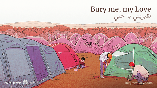
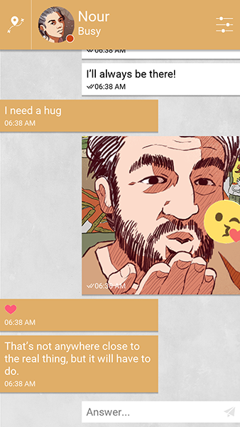
In conclusion, let’s go back to our project, Bury me, my Love. Nour and Majd, our two main characters, do not really exist. Yet, they are directly inspired by lots of Syrians whose lives have radically been redefined by the civil war in their country. The consequence of that, for them, is a separation: Nour leaves for Europe but Majd stays in Homs in order to support his family. They only have their smartphones to stay in touch.
The game is directly inspired by an article on Lemonde.fr, and more broadly by the way migrants use communication apps such as WhatsApp to chat with their families, ask for advice and seek information during their perilous journey. We want to build a model of this reality and let our audience understand through play what those people experience. We hope that playing this game will make you ponder, and relate, and that it will stick with you for a while after you finish it.
Is it disrespectful or pretentious to make a game on such a tragic issue? I don’t think so, and neither does Dana, the Syrian refugee now living in Germany who helps us write it. After all, if reality may inspire games, it may work the other way around too…
It is now official: after more than 3 years of commissioned works and dozens of insightful, fulfilling and (also, sometimes) nerve-wrecking projects, The Pixel Hunt takes the great leap ahead. A few weeks ago, together with the awesome guys at Figs (who do interface design and magic tricks for a living), we kicked off our first game as an indie studio.
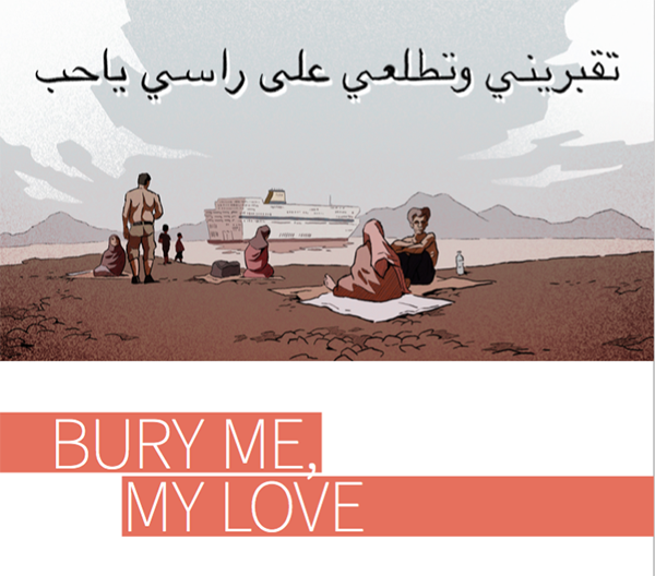
Of course, it is a bit soon in the process for me to tell you much about it here. Its (temporary) title is “Bury me, my Love” – that’s a phrase in Arabic that means “Take care”, “I don’t want you to die before I do”. And indeed, the game’s main characters, Majd and Nour, are a Syrian couple on the verge of being separated. Nour is going to leave for Europe, in the pursuit of a better life. Majd has to stay in Syria and take care of his family in his war-torn hometown. Now, the instant message application they both installed on their phones is the only way for them to keep in touch – and for you to help Majd assisting Nour in her dangerous journey. “BMML” is a reality inspired interactive fiction, to be released on iOS and Android mid-2017, at least we hope so.
Here is the first post of an arguably steady paced development diary. Those are seemingly useful for various reasons. First, I’m pretty sure the coming month will come and go in a blast. If I don’t start keeping tracks of the project since the very beginning I won’t do it at all – which would be a shame, because if we fail I want to keep track of why, and if we don’t I want to be able to explain how. Then, as it’s The Pixel Hunt’s first indie project, there’s plenty of wannabe indie devs out there that could get inspiration from our experience, regardless of its fate. And last, the opposite is true too: if you’re a senior indie who reads my existential questions (and there will be many because as any good French I often tend to go full Jean-Paul Sartre), don’t hesitate to share your lights!
So, I tried to think about a good topic for my first devlog post, and found one: FEAR. Because of course, I’m freaking out right now. And to be honest, I tend to think it’s a good thing, as basing a development process on yolos and que serà seràs might prove hazardous. Then again, I also think it is important to try to understand where this fear comes from, what its main reasons are, and face them in order to come up with appropriate answers.
So here we go: four things that terrify me since I’m officially an indie dev.
First cause of fear: funding
I’m not a cool kid anymore (I’m 36 dammit), and I’ve never been the kind of guy who is obsessed about one thing in particular. That might explain why I don’t buy the whole indie dev mythology. Spending years in front of a computer, 7 days a week, eating only instant noodles boiled in passion, that doesn’t appeal to me at all. Well, to be honest, I wouldn’t be able get any game done that way: I can’t code, I can’t make art and my stomach is too delicate (did I tell you I’m French?) But even with boeuf bourguignon instead of noodles, I still think making a good game in those conditions is ridiculously difficult.
Not because of the amount of work required, but simply because – I hate to say it – most of us people aren’t geniuses. Not everyone is Blow or McMillen or Phil Fish or whatever. Lock guys with such vision and creative genius in a room for months and they’ll build a game that smells like fesh flowers and morning dew. But do the same thing with the average Joe? You’ll get overused socks and stale food scent for not opening the window from time to time.
Don’t get me wrong, I don’t have anything against hard work, dedication, risk taking and sleep deprivation – proof: I have TWO kids – but the very idea that you need to put everything you have at stake to really create something good puzzles me. I already risk my company’s health in the process of making BMML, I don’t want to add my family life and my physical and mental wellbeing in top of that.
That’s why we at The Pixel Hunt and Figs had to build a strong plan to pre-fund BMML. We had to find the money to pay all the cool people who are going to work on this project, and we naturally could not rely on any of the revenue generated by the game (providing it earns any money, you have to finish it prior to be able to sell it, duh). We don’t have any investor to help us with that. We don’t have a publisher that might grant us an advance on earnings. So we invested our company’s cash and our ability to fund our personal time spent on this game with other projects we still do for clients.
This puts me in an odd situation, as I have to work on many things apart from BMML in order to properly fund BMML’s production. Hence the fear of not being free to invest myself in this project as much as I’m keen to. While having to work even more than usual. Maybe instant noodles were not such a bad idea after all.
Limited funding ability also has an impact on game design. I’ll give you an example: last week, we had a discussion about putting audio messages in the game. On the plus side: they strengthen immersion, they propose an interesting narrative variation, they have a strong emotional power if the voice acting is good… There’s a long list of pluses. On the negative side: IT. COSTS. MONEY. Even more if you want to localize the game in a series of foreign languages. We haven’t taken a final decision yet…
Call me stupid, but I only now come to realize that working on your own game idea is addictive. You think about your game concept, you refine it, polish it, even fall in love with it – and I mean, that’s a good thing, because you’re going to need all that love when you’ll be knee-deep in crunch mode. So, even if creativity sometimes benefits from constraints, I can’t help but wonder how many cool features I’ll be able to kill for budgetary reasons before I wake up next to my game and realize it is not the sexy pitch I fell in love with, rather an old, wrinkled, tired thing I wasted the best years of my life away on (hum well maybe I’ll stop the love affair metaphor there, you got the idea). I just hope we’ll be able to make BMML as great a game as we imagine it will be.
One way to face this fear is to stay modest in our game design ambitions. Another is to search for additional sources of funding. That’s why I’m now going to pass the hat and… Just kidding (well for now, at least – we may set up a Kickstarter campaign later in the project). Seriously though, regarding this issue, there’s something cool about being French: you can apply to a public funding programme called “Video Games Help Fund”. The deal is quite simple: if your project is selected, they will give you 50% of the cash needed (there’s a € 200k limit though). Neat, eh?
Results for the round we applied in are not published yet, so we keep our fingers crossed – because finishing the project without their help will be a very, very tough case. Of course, thanks to dematerialisation, the last decade has seen a significant drop in the ticket price to enter the video game market. But even today, there’s still a minimum non-reducible cost to making a good game. Should BMML be a commercial failure, The Pixel Hunt – if it survives – will have to go back to commissioned project and through a long saving process before we’re able to work on another indie game. That’s one more reason not to blow it.
Second cause of fear: the topic
As if making a game wasn’t already complicated enough in itself, being a former journalist, I convinced myself I had to make a game about a very complex, reality inspired issue. I like to pitch BMML as a “love story simulator” – and the game definitely is about what it means to love someone you’re far away from. But our main characters, Nour and Majd, are in a very specific situation: they are separated by the war in Syria. Majd won’t leave Homs, his hometown, because he has to support his remaining family; and Nour is unable to stay, now that all her folks are dead or missing. So she has no other choice but doing what more and more isolated women do these days: she leaves to Europe, by herself, hoping everything will be alright. Spoiler: it never is.
Of course, I’m pretty aware that making a game on Syrian refugees will upset a lot of people. There will be grunts from those hostile to migrants who will accuse us of glamorizing them and growls from those who will scold us for making a game out of such a serious issue (as if games were doomed to frivolity). And that came as a surprise to me, but my previous reality-inspired games also took a lot of fire from video games enthusiast, because they considered games should remain sheer entertainment and never hold any political or philosophical value. After all, even Apple seems to agree with that, as the brand regularly takes “sensitive” games off its virtual shelves. We all are someone’s reactionary, I guess.
That’s the reason why we will work on adding a plumber with a moustache and several dragons in BMML. Not. That’s the reason why we will work hard to make our game as honest as possible. We want it to be a fiction, but a documented, sharp and realistic one. We will try to endow it with the most human story possible. We think that great games can be directly inspired by the world around us. Games that will stick around after you’re done playing, when you watch the news, read the newspaper or bump into a family begging in the street… This doesn’t mean we don’t enjoy light-hearted, entertaining games – I, for one, have been struggling for years with a severe case of Pixel Dungeon addiction. But this means that we believe games are as valid a medium as literature or cinema to explore serious topics and tell mature stories. And we also believe there is an audience for such games.
If you ask me, this conviction is enough to do our project the way we see fit, against all possible reluctances or knee-jerk reactions it might trigger. Or in other words: fuck it, lets get shit done. But how do I know I’m not deeply mistaken? How can I be sure BMML will not be welcomed with unanimous anger, or worse, apathy? This is another frightening thought: the fear of being wrong in our belief of what games may be. Successes such as Papers, please, That Dragon Cancer or Firewatch tend to strengthen my beliefs, but our sales figures will be the only objective metric of whether we were right or delusional.
Third cause of fear: the team
I really started to believe we were off to something good with BMML when we managed to federate a great team around the project. I mean, look at them. You just need a 5-minute chat with the guys at Figs to realize they can fit the answers to all the world’s problems in a single button. Pierre Corbinais wrote one of the greatest love stories I ever played, which is no small achievement considering it features two drug addicted, cattle-stealing cowgirls as its main characters. Paul Joannon (code) and Matthieu Godet (art) have been making cool games together for ages and are very funny to sit next to (even though I can’t understand a single word when they talk about Street Fighter tournaments). And Dana (the Syrian refugee who inspired BMML’s story) and Lucie Soulier (the journalist who first reported on Dana’s story), they were so enthusiastic about the project that it definitely convinced us to do it.
I am very glad to have the opportunity to work with all these people. It is important to state it, as I know from experience it is not always the case. I hope we’ll manage to keep this great atmosphere until the end (even though I’m the tallest of all, which is a notable advantage should things go ugly).
But still, I listed “the team” as a cause of fear. That’s because, to me, it is not easy to bear the responsibility of being the project leader. But let me be clear. I have run a business for 4 years now, I have done a lot of project management – it’s not leading a team I’m afraid about. I know how to be the bad cop, how to ask people to start over, how to be annoying enough for deadlines to be met. This doesn’t bother me, and I almost find pleasure in it (although probably a sadistic one). But until today, I have almost exclusively been working on commissioned projects. More often than not, we had clear mission statements, and even though I often happened to be the lead project designer, I always was working on behalf of a client.
Things will be different for BMML. We won’t have anyone to blame if the game doesn’t live up to our expectations. I won’t be able to grumble about a diffident client or a broadcaster that “doesn’t have a clue what he’s doing” (if you’re one of my clients: I’m definitely not talking about you. You are great.). There will be no way to dodge responsibilities.
Of course, BMML will be a collective work and every team member will be partly accountable for the quality of the final product – be it a hit or a debacle. But as the author of the original concept and the project’s producer, I feel invested with extra liability. Maybe I’m wrong, but I can’t shake away the feeling that I’m asking those people to spend time and energy on a risky project – what if it sucks big time?
Does BMML suck big time? Of course, I am firmly convinced that the opposite is true – but I cannot guarantee it 100%. So I might as well book a ticket to Neverland for the day the game is out, just in case I need to disappear.
Fourth cause of fear: marketing
I’m not going to dig up the exact figure – it’s way too depressing – but I think something along the lines of 500 new mobile games are published on the App Store every day. Most of them are completely free, and a vast majority of the remaining part is at least based on a free-to-play model. Then, there’s the big fishes that are simply everywhere thanks to millions of dollars spent in advertisement. So yes, of course, we live in a world where more and more people are video games players. But if you pay attention to what people actually play, you’ll see a lot of Candy Crush and Clash Royale, and very little of everything else.
One may think that having a premium title out in such a context, without an army of PR managers and the GDP of Andorra as an advertisement budget to back it up is a foolish choice. And indeed, it is.
Maybe it would be less foolish if a publisher came into play. Sadly, In France, there are very few publishers that are willing to take the risk of promoting a premium mobile game – let alone a game with an arguably controversial topic such as BMML. And as far as I know, that’s pretty much the same in the rest of the world. We haven’t given up looking for the one-in-a-million company yet, but there’s obviously no guarantee we’ll find it.
Here’s the catch-22: convinced as I am that there is a mature market for games such as BMML today, I am not positive that there’s a structure out there with the ability, the will and/or the boldness to help us reach that market. Because such a structure would have to go beyond traditional game marketing and try to appeal to people who don’t play – or who used to play as children/teenagers but quitted. They would for instance have to find ways to convince the average Guardian reader that she may enjoy using her smartphone for something else than checking bank accounts. They would have to reach out to the New York Times or Le Monde as well as Kotaku or Pocket Gamer, or try to appeal to book reviewers as well as Youtubers in their PR efforts.
Take my sister, for instance. She hasn’t touched a video game since she gave up on her NES. Yet, we will work on BMML’s accessibility in order for her to be able to instantly understand, play, and hopefully enjoy it. But for this scenario to unfold, she has to be aware of the game’s existence first (I’m not actually talking about my real sister here – Sis, if you don’t play my game, YOU CAN FORGET ABOUT YOUR CHRISTMAS PRESENT).
In a nutshell, I believe the only way for BMML to reach a wide audience is for us to imagine a broader communication and marketing strategy than the one usual games have. I kind of agree with Leigh Alexander’s controversial stance: nowadays, for a project such as ours, it isn’t useful to address “gamers” as our core audience. Everybody with a smartphone will be able to play BMML, and playing it won’t make you part of some kind of tribe.
But for more than three decades, video games marketing has been quite cryptic and full of references that make very senses to a specific part of the population but leave the vast majority puzzled. Pushing a more inclusive message might prove difficult. If we’re not able to find a publisher to help us in this endeavour, we’ll have to do it on our own. This isn’t an impossible task, but it is going to demand serious sleeves uprolling.
_ _ _
Ok, I think we’re going to end this anxiety show here. I also could have said a word about compatibility issues, competition, launch day panic, OS updates that break your game, and so on. And this is only the tip of the iceberg, as I am perfectly aware we will face with a hell of a lot of unforeseen issues during the development process. Sigh.
So yeah, developing a game is a long, delicate, very complicated process – no wonder it is super scary! But let me put my wise old man’s cap, light up my pipe and tell you a good thing: this is the EXACT reason why it is so interesting. Getting out of one’s comfort zone, taking risks, racking one’s brains to take up the challenges as they appear… Of course, we are going to suffer – but we’re also feel super alive! That’s what makes me more excited than frightened. So let’s do this!
For the last year and a half, the team behind Bury me, my Love have been working on this reality-inspired game about a Syrian migrant’s journey to Europe. Florent Maurin, the project’s creative director, tells all the steps to a very intense 18 months.
18 months ago, we started working on the production of our first independent video game, Bury me, my Love. If you haven’t heard of it, it’s a text-message based interactive fiction that tells the story of Nour, a Syrian woman who decides to leave her war-torn country. She wants to reach Germany, and she has to make this dangerous journey alone as her husband Majd cannot come with her. You play as Majd (even though he, as a character, has his own personality), and you have to provide Nour with advice and support, all this through text messages, selfies and emojis only. This is what I call a reality-inspired game, a fiction directly derived from real events — and, in this case, from interfaces we’re used to using.
Bury me, my Love’s production was sometimes easy, sometimes a complete mess. We made mistakes, overlooked things, and learned a lot. So I figured I’d share our experience, as it might be useful to others — keep in mind it was our first project as indie devs.
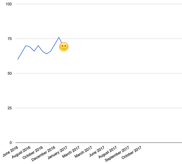
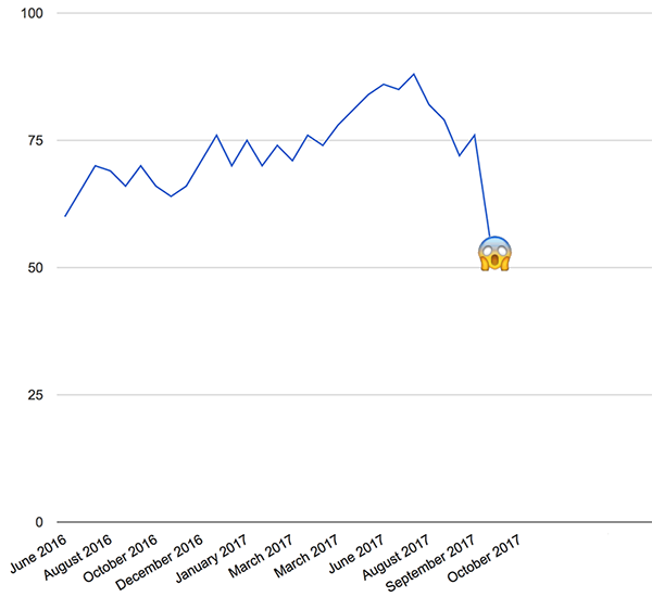
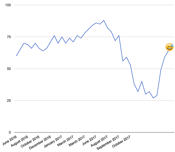
There’s just one thing you should know before I start. In the game, almost every decision you make may have an impact on one (or more) of the three variables that define Nour’s state: her romantic relationship with Majd, her money and her morale. For this piece, I’ll leave money and love out of the equation (they could be the subject of two separate articles) and focus on morale only. Let’s say I start with a good 60 morale points — as Nour does in the game. Here we go.
June 2016.
After reading a very touching article in Le Monde (The Journey of a Syrian Migrant as told by her WhatsApp conversations), I decide to make a game about how migrants communicate with their loved ones when they’re on the road. But obviously, I won’t be able to tackle such a delicate topic without getting help from people who know the situation very well. So I get in touch with Le Monde’s journalist, Lucie Soullier. Lucie is not at all familiar with video games, but after I explain what I have in mind in detail she agrees to introduce me (via WhatsApp) to Dana, the Syrian woman from the article. Dana is immediately enthusiastic: she thinks a game could be a great medium to tell the stories of people like her. Lucie and Dana accept to be part of our editorial team, and I feel that with their help we’ll be able to write a believable story. ~morale = morale+5
I get in touch with people I know to ask them whether they’d like to join in. Pierre Corbinais’ a great writer, he knows how to write dialogs that feel genuine and he’s a former journalist, which is important for this game’s topic. Paul Joannon’s got XP in game development and worked at French newspaper Libération until he decided to quit, quite recently. For the interface design, I’d like to find people who worked on apps before in order to get a WhatsApp look, and I know just the right team for that: Figs. And the artist, Matthieu Godet, has worked with Paul before, which is definitely a good thing.
To my delight, everybody likes the project and wants to be a part of it. Even better: Figs are OK to co-produce it! ~morale = morale+5
July 2016
Figs and TPH have some money to invest in the game, but that won’t be enough, so I have to find more elsewhere. There’s this thing in France, the Centre National du Cinéma’s Fonds d’Aide au Jeu Vidéo (Video Games Help Fund). It gives grants to innovative projects, so we apply.
The cover to our very first presentation of the game.
The required presentation is a good opportunity to have a clearer project: we define the story, the game design, the tools we’ll be using, make a budget & market analysis… But I have to finish the application during a weekend that I had planned to spend with old friends. As I struggle with a weak Internet connection I hear them eating homemade burgers and drinking cold beers without me. Worth it, but still a bit sad. ~morale = morale-1
August 2016
Since June, Pierre and I have been gathering documentation and reading a lot of testimonies by migrants who undertook the journey between Syria and Europe. I had read things on the subject before, but digging into it makes me realize how bad the situation is. This is intense, and it also makes me question my position in the project. As a healthy European, living a fairly comfortable life, is it really my place to make this game?
That’s the thing with reality-inspired games: they basically require you to talk about other people’s lives. But as a former journalist, I’m familiar with the process. I’ve learned the importance of finding the right distance with your subject. We’re not superheroes with capes, we don’t have the pretension to come to the rescue and save migrants from a gloomy fate. Nor are we an NGO with an activist’s agenda. We just want to tell those stories in the form of a video game, for players to acknowledge them and what they say about the world we live in.
As neither Pierre nor I are Syrian refugees, Nour and Majd’s story is going to be a fiction. But to work as a reality-inspired game, it needs to be as truthful and believable as possible. There’s a lot of work ahead to achieve that. ~morale = morale-3
September 2016
We got money from the French CNC! They seem to have liked the project and decided to help us. That’s a good thing because now I know we’ve got enough money to make Bury me, my Love happen. Of course we’re on a tight budget, and we may have to cut out some of the features we’d like to have during the development process, but still. And now that we’ve got the CNC’s support, we might be able to convince other partners to join in. I immediately think about ARTE, the European TV Channel. They’ve been investing in games recently, and BMML seems like a perfect fit for them, so I send them the project. ~morale = morale+4
I have a series of WhatsApp chats with Dana. The things she went through, both before living Syria and during her journey, are really chilling. Yet, she never complains. She just states the facts and how she faced them. I’m really impressed by her, and I start writing Nour as a character with her in mind. I also ask Dana about how life in Germany is. “The people here are really great”, she tells me, “they treat me nicely. But I’ll never be fully happy, until I know my mother is safe.” Her mother still lives in Syria. ~morale = morale-4
October 2016
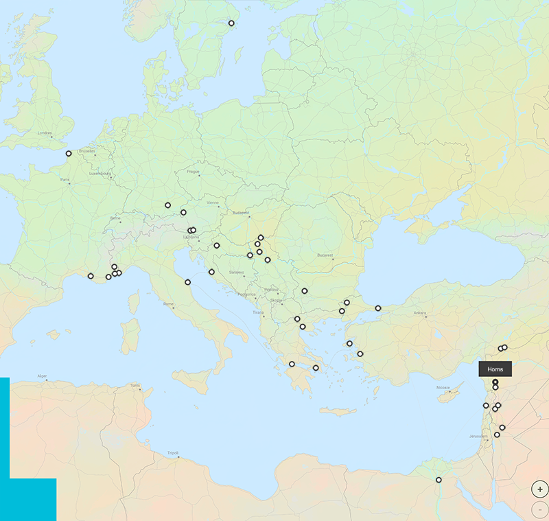
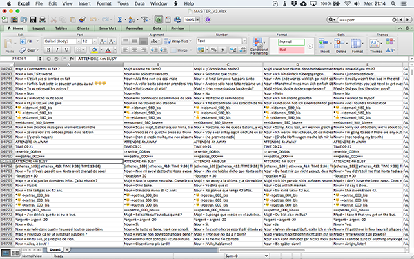
Both Pierre and I start writing the game. First, we make a map of all the main routes migrants may take between Syria and Europe. We’d like to give players the possibility to explore both the northern (Turkey -> Greece -> western Europe) and southern (Egypt -> Libya -> Italy) routes, but we soon realize that would be too huge a task. So we stick with around 50 locations that appear to be the most visited ones (the northern route, mainly), and trace the actual paths that link them together. This mapping is going to be our guide for the whole writing period. There’s a slight feeling of incompletion to it, though, as I’d really love to use all the material we gathered and tell as many stories as possible. ~morale = morale-2
In a typical playthrough, you’ll only see 15 to 20 of those places.
Paul, our main developer, is a huge open source fan, and he convinces me that using Unity (like everyone does) might, in the long run, do more harm than good to the ecosystem — after all, having one big player in a monopolistic position is never a good thing. So we review the open source cross-platform engines that are available and finally pick MonoGame. This will make the project slightly more complicated, we’re aware of that, but we take pride in staying true to our convictions (this will prove 100% foolish, as you’ll discover later J). Thanks to the awesome folks at Inkle, we opt for Ink as an open source scripting language, and even our git client is open. How cool is that? ~morale = morale+2
November 2016
Development starts. We’re officially MAKING A GAME!!! Let’s try our best. ~morale = morale+5
December 2016
We’ve got an early prototype! There’s just a fraction of the content in it, and it only has the core features (messages and images display + phone notifications), but it works! The feeling is amazing, and this really confirms my intuition that text-message based storytelling is something quite powerful. I already feel like I’m talking to Nour. ~morale = morale+5
We get two setbacks in a row. The first one comes from publisher Devolver. We contacted them because we thought they might be crazy enough to publish BMML. We were wrong. Then again, our hopes weren’t that high.
A bigger blow comes from ARTE, though. Since we had sent them the project, I grew pretty confident that they’d be interested in it, and willing to start a coproduction. This would be super cool, of course, as we run on a very tight budget, even with the FAJV grant. Think about all we could do with more money! Sadly, most of the folks at ARTE don’t seem to be convinced. It’s not a blunt “no”, but… it’s not very far from it. They’ve got their doubts about our ability to find the right distance to the topic at stake. I think we’re able to do this Right, but quickly run out of arguments. So as a last resort, I ask the ARTE team to test our prototype during the holidays — but I have the feeling it won’t make a significant difference… ~morale = morale-6
This is my morale evolution. Sure, there’s bumps in the road, but until now, it’s OK.
January 2017
…and I was so very mistaken! In the first days of 2017, I get a call from ARTE. They played the prototype, they really liked it and all their editorial doubts vanished! I had been told before that having a prototype was important, but I did not realize how true that was. Yet the cat’s not in the bag: they still have to undergo a complicated, multi-step internal validation process, and things could still very much go sideways. So let’s hold our horses there. ~morale = morale+5
A woman I’m in contact with for the project invites me to come have a look where she works. She’s volunteering at the migrants’ orientation center in La Chapelle, northern Paris. The situation is complicated, to say the least. There’s far more applicants that there is room, people queue to get food or clothes, fleas are a real issue and the general mood is quite tense. In the past few days, there have been fights, and some dudes even ripped small trees off to use them as clubs!
I realize something important during this visit. The fact is, migrants are held to a very high standard. They have lost everything, risked their lives, may not ever see their families again… and yet they are requested to stay calm as they sleep in the streets, waiting for a hypothetical place to settle. There’s something deeply disturbing to that. ~morale = morale-5
February 2017
All is well production wise. We’re a bit behind schedule, but then again, who isn’t, and the art Matthieu makes really looks like a perfect fit to the project. On top of that, a fellow indie dev tells me about a private community that gathers the heads of small game studios. He presents it as a place full of cool people, a great way to share experience and get very good advice… I could definitely use that! So I join in, and almost immediately feel at home. Sure, there’s only a fraction of the indie game scene there, but there’s very positive vibes, the discussions are full of great takeaways and most importantly, I feel I’m really part of a community. This is great! Oh, and being part of this group will basically save the project’s life in a few months, but I’m not aware of that yet. ~morale = morale+4
Bad news in the mail: we’re not selected at AMAZE. This is a bummer because 1) AMAZE is kind of THE place where “different” video games belong, 2) I really LOVE this festival and 3) we did not even manage to get an “honorable mention”. I know, I know, this happens to A LOT of great games… but that doesn’t make it any easier to process. For the first time in the project’s life, I have a doubt. What if BMML wasn’t such a good idea? What if people found it tasteless, or even worse, simply did not see the point?
Well, it’s too late to turn back now anyway, I tell myself. But this is going to keep me up at night a bit. ~morale = morale-3
March 2017
We now have a really decent prototype, with more features coded and around 20% of the game’s content integrated. The interface designed by Figs is really neat, and the story flow feels good. Time to have Dana play it. We send her an .apk, and anxiously wait for her feedback over WhatsApp… And it’s very positive! She tells us she loved it. She played with her sister, who went full emotional and did not want to let Nour go at the end of the demo. This reaction is such a relief to me. It was very important to have Dana’s approval. I am aware she doesn’t account for every Syrian migrant there is, but she trusted us and helped us, and we really wanted to live up to this trust. So far, that seems to be the case! ~morale = morale+5
Another month, another rejection. This time, it’s from the great guys at Raw Fury. They were clearly interested in the game, but as they don’t do mobile-only projects, they had to pass. A shame, though, because I think working with them could have been really cool. Maybe next time! ~morale = morale-2
Being signed up for selection at AMAZE at least had a positive consequence: Chris Priestman gets in touch with us. This is really cool, because he’s a games journalist I love to read. We have a chat over email, and he writes this great piece on Waypoint. That’s BMML’s first press coverage, and it is not a small one! A few days later, I bump into a piece by Colin Campbell on Polygon, about a game that shares similarities with BMML. So I decide to go for it and @ him on Twitter… and he responds! A couple weeks & emails later, we’re on Polygon.
I guess the lesson here is: don’t be afraid to reach out to games journalists whose work you appreciate. Of course we know that press coverage is of the essence, so we’re basically through the roof! ~morale = morale+4
A quick selection of question Dana answered via WhatsApp over the course of the last few weeks:
Do young Syrians send each other sexy pics?
If you get random checked by soldiers around Aleppo, what do you do?
Have you ever heard of the Road Runner and Wile E. Coyote?
What are some typical jokes you told your sister when you were 8 years old?
Could someone who’s religious and someone who’s absolutely not marry each other?
How do you say “Grandpa” in Syrian?
How exactly does a border check look and feel like?
Some of them made her laugh, some made her relive complicated moments, and some left her quite puzzled! For us, she’s always a very precious help. ~morale = morale+3
Using Ink is great, because you can preview your branching narrative.
April 2017
Writing is finally OVER! We’ve got 110k words of text (that’s A LOT), and I think it’s pretty good… But who am I to say? So we ask both Dana and Lucie from Le Monde to read it all and give us their most honest feedback… In the upcoming weeks, we’re going to tweak and rewrite passages according to their input, to be as believable as possible.
I still remember this scene where Nour meets a smuggler: we had to tear it down and rebuild it up from scratch because Dana was positive it wasn’t scary enough!
In other news, the EN localization is about to begin, and it’s none too soon, because our initial plan is to be out by the end of June. Also we manage to attend AMAZE anyway, in the Open Screens category. It’s the first time we show BMML to the public, and the feedback is very positive. Also, we welcome Audrey in the team as a PR intern. ~morale = morale+3
May 2017
A remarkably quiet month. I spend ages integrating the game’s text and pictures and fixing all the broken links between story passages (thanks god for Nils Frahm, I listen to this concert on repeat), which is a real pain. But on the positive side of thinks, ARTE’s finally on board! We’re going to be able to afford translating the game in 5 languages (which would definitely be useful to get a featuring from Apple), add some features, spend more time polishing the game… Plus we’re getting very useful feedback from people who still have a fresh eye, like Marie and Adrien. We’ve been knee-deep in BMML for almost a year, we don’t see things clearly anymore. The folks at ARTE, on the other hand, are not as attached to the project as we are. They won’t hesitate to be sharp in their feedback and critics, which is healthy and useful. ~morale = morale+2
June 2017
Everything is going according to plan… more or less. Localization in EN is almost done and we found cool people to translate the game in German (ARTE being involved in the project, this is mandatory), Spanish and Italian. I wish we had a version in Arabic but that’s technically more complicated to make so we’ll have to postpone it until after the game is out (and, hopefully, financially successful enough).
We also have a final validation by Dana, and very positive feedback from both the playtests we run and the people who play the game at Games Happen and Indigo, where BMML has been selected.
And on top of that, we found a publisher! The team at Playdius enjoyed the game and are willing to help us have it out. Good to have them on board.
Still, the end of June is there pretty fast and I can’t help but feel worried. According to our initial schedule, we should be finished by now — yet we’re obviously still quite far from being there. Of course, there are reasons for that. With ARTE now on the loop, the project got more ambitious, and this doesn’t go without some extra work. And then again, who has ever heard of a video game that was delivered on time? Still, I don’t like the feeling I get. We’re close, but not quite there yet — let’s not forget that. ~morale = morale-1
July 2017
Current morale trend: to infinity and beyond!
Since the beginning of the project, I wanted each of the game’s 19 endings to be an audio message from Nour. That would be the first — and last — time the player would hear the character’s actual voice, and I thought that could be interesting. Casting Nour’s voice was a strange process, as I never actually had thought about how she might sound. Fortunately, we managed to find very talented actresses, and Baya Rehaz (Nour’s voice in French)’s performance particularly struck me. After months and months working on a character, I had the impression I was finally able to hear her come to life. This really is a one-of-a-kind feeling. ~morale = morale+3
THERE. ARE. SO. MANY. BUGS. I mean, I’ve been making web games before, and I’m pretty familiar with the slow, painful process of game debugging/polishing, but still — this is another level. Messages not showing, notifications not working, images suddenly going black, odd glitches we’re unable to reproduce… It’s coming down hard! And that’s not to mention all the possible remaining scripting errors. When you’ve got a 110k words script, with 2165 possible choices, there are MANY occasions for things to go wrong. Multiply that by 5 languages, and you’ll get why, at some point, I feel like crawling under my desk and never get out again. ~morale = morale-6
August 2017
Ok, time to go on holidays. Is the game out yet? No. Is it going to prevent me from spending some well-deserved time off with my beloved family? Of course not!
110k words in 5 languages makes for a HUGE spreadsheet.
Well… that’s a nice thing to say, but as a matter of fact, I spend pretty much every vacation day working. Yes, it’s only small chunks here and there, but that’s maybe eve worse: I’m with my loved ones physically, but not really available mentally.
In general, I’ve noticed that in the past few months, I’ve been far less patient as a father, and less available as a partner. Sleep deprivation and endless to-do list have clearly damaged my ability to be patient and attentive. That’s not a huge deal, and my two daughters and my significant other are very supportive, but that annoys me that they have to pay a price for me doing this game.
As we’re supposed to be out mid-September, I assuage this trouble by telling myself the end of the project is near.
Except it’s not. ~morale = morale-3
Around august 10, our developer, Paul, tells me he’s in the hospital. The details are obviously private, but it’s looking serious enough for him to be prescribed with a 1-month sick leave. He’ll officially be away until September 15. I worry about this, of course. Paul is a good friend and I want him to be OK. But he’s pretty reassuring: there’s no way for this to stop him from working on a project he loves! I tell him to take all the time he needs. As I’m the optimistic type, I’m confident he’ll be better soon with a few weeks’ rest. Still, this is a shocker.
Regarding the game — well, there’s no rush, of course. We’re close to the goal, and we’ll release a week or two later than scheduled if we have to. ~morale = morale-7
The end of August comes with great news. Bury me, my Love has been picked to be part of IndieCade US’s official selection! This is great on so many levels. First, it’s an honor because IndieCade is a festival I’ve been following for years, and I’ve discovered some of the games I care the most about thanks to those selections in the past. Then, BMML’s our first game, so even if we don’t win (spoiler: we won’t), being part of the selection already is an honor for us. And last but not least, this’ll probably be a great opportunity to meet other indie devs from around the world… in Los Angeles, of all places! ~morale = morale+4
September 2017
Paul isn’t getting better. In fact, there’s no way to know when he’s going to be back on his feet. He’s obviously in need of a VERY serious time off, without any source of worry or pressure, and each time I bug him with questions related to the game, I feel I add to his stress level. If we were two dudes in a basement, I would simply put the whole project on hold until further notice — but there’s a lot of people involved, and we just can’t do that.
So I come to terms with the idea that I have to find someone to replace him. It’s heart breaking because we’ve been working together on this almost since Day One. I know I’m going to miss him a whole damn lot.
Now, remember when I was bragging about going full open source, and how cool it was? Well, that’s before I had to find a developer who knows how to use MonoGame, 6 weeks away from the day we were supposed to release a game… ~morale = morale-20
…but hey, cool things happen too, sometimes. As I already mentioned, I’ve joined a French indie game devs community earlier this year, and met lots of nice peeps there. Among them is Thomas, a lovely gentleman who
is probably the best French MonoGame dev there is
just happens to be available for the weeks to come
In retrospect, I fully realize how unbelievably lucky we’ve been to find him. Without him, there simply would be no Bury me, my Love, period. But at the time, still stunned by Paul’s misfortune, I just think “Well, this is nice”. ~morale = morale+3
Luckily enough, Paul commented his code pretty well, which is something you should ALWAYS do — but don’t always do, especially when you don’t think you’ll ever have to collaborate with someone on a project. In a few days, Thomas is able to understand how the game works and start working on fixing bugs. The first thing he does is to update MonoGame to a more recent version, which fixes a lot of small issues and instabilities we had.
But there actually was a reason why Paul did not update MG — a reason Thomas and I don’t know about. The thing is, the selfies and pics Nour and Majd send each other in the game are pretty big files — they have to be, in order to fit high-end smartphones screen resolutions. Such images are quite heavy, and we have next to a hundred of them. For a few months, Paul and I have been careful for the game’s builds not to be over 100MB, because if you go over this limit, things get more complicated — I’ll elaborate on that soon. We were very close to this limit, but we had a backup plan. At worst, we thought, we’ll use .jpgs instead of .pngs.
But in MonoGame’s latest version, you’re not allowed to use images in external formats anymore. They have to be converted to textures, and this changes everything. Suddenly, the games builds jump from around 90MB to over 180MB. When Thomas and I notice that, he puts a lot of work — and time — in optimizing everything to lose as much weight as possible. But after a couple weeks, we realize we won’t be able to go under the 100MB bar again.
This is no big deal for the iOS version, though — worst case scenario, Apple users will be forced to have an available Wi-Fi connection to download the game. Not ideal, but still manageable. On Android, though, things go sour. In order to be available on Google Play, every game above 100MB needs to be split in one .apk file plus one .obb extension. This is no rocket science per se, but that’s another (big) bullet point on our todo list. And we’re on a tight schedule: after a discussion with our partners at ARTE, Figs and Playdius, Bury me, my Love’s release date has been set to October, the 26th. ~morale = morale-6
October 2017
We have a stable, fine looking version of the game running, and a couple days ago, we submitted it to Apple — a month before the release date, as it should be. Now, I’m at the airport, ready to take off for Los Angeles and show our work at IndieCade US. I’m all pumped up, and even security check seems fun. But as I’m waiting to hop on the plane, I get an email from Playdius.
Well, Steve, I recognize a crisis when I see one… MORALE DOWN!!!
“Apple has rejected the game.” ~morale = morale-15
As I’m flying across the ocean, I’m reviewing the reasons for the rejection. It seems to contravene the guideline 4.2, about “Minimum Functionality”. Isn’t Bury me, my Love enough of a game? Surely that can’t be: we’re selected in videogames festivals, we’ve got 19 different endings with thousands of options for the player to choose from… And other text-heavy interactive stories are published on the App Store every day! In a word, I’m completely puzzled — and a little bit depressed.
During the time I’m in LA, the team in Paris builds a detailed presentation of BMML’s functionalities. Gameplay videos, narrative maps, branching and consequences… everything is explained with lots of details. The game is submitted again… and again, it is rejected. Now, I start wondering: could the game’s content be the issue here? Could it be problematic that our game is directly inspired by real events? If so, we’re busted, because there’s no way we could possibly change that — Bury me, my Love would lose all its meaning in the process.
In the meantime, I get lots of super positive feedback at the festival. That makes me feel a bit better, and I even come to thinking that, should we get an award, it might help our case. Sadly, we don’t win any prize, and it’s time for me to fly back home. ~morale = morale-6
But a discussion I had with a gamedev friend stuck with me. Armel Gibson is incredibly talented, and his game, Vignettes, has been featured by Apple earlier this year. “Maybe”, he tells me after trying out BMML, “you should have more interaction earlier in the game. It’s quite a long introduction you’ve got there, and there are many of moments where you just watch Nour and Majd talking to each other. Maybe you should consider changing that”.
I’m not sure he’s right, but we’re out of options anyways. And making a mobile-only game already is risky enough — not having an iOS version of it would be fatal. So I spend the entire flight back modifying the game’s script to add more choices, and when we land, I use my cell phone to send the new version to Thomas. He builds. We submit to Apple. And I can’t stress enough how important it is to have other gamedevs around to provide you with fresh feedback on your work, because the submission is accepted!
Thanks Armel ❤ ~morale = morale+8
Ok. It’s now October, 25th, and tomorrow is the big day. We’re all set and good to go. But in the afternoon, I get a message through the game Facebook page. It’s from someone who heard about the game in the press. “I know it’s only supposed to be out tomorrow”, he tells me, “but I just can’t wait so I went on Google Play today, and as I noticed the game’s page was already live, I bought it. The problem is, it’s not working. I suppose it’s because I’m one day early, but I figured I’d just ask you about it…”
The Google Play page is indeed already published because we don’t want to have to deal with delays in publishing tomorrow. But no, there’s absolutely no reason why the game wouldn’t work.
So I check with my three test phones, and it works just fine. But then, I borrow a coworker’s phone… and it doesn’t. A few other tests later, I must face the awful truth: our game’s Android version won’t work on A LOT of different Android devices. ~morale = morale-10
We’ve got an emergency chat with Thomas and try to understand where the issue comes from. In parallel, I keep Paul updated on the situation, and after a couple minutes, he finds out what happens. It’s the notorious .obb file that’s the root of all evil. It’s properly downloaded from the store, but after that, there’s a permission issue that impedes the .apk file from finding it on the device. Proof is, restarting the phone fixes the problem. This isn’t looking that bad after all. I go to bed around 1AM, with Thomas reasonably confident: he’s going to spend the night on it but he thinks he’ll be able to patch the issue. ~morale = morale+2
Here we are, October 26th. The game is supposed to be out today, and our PR agencies have scheduled a press release for around 3PM Paris time. Meanwhile, we still don’t have a working Android version. Around 11AM, Thomas finally builds a new .apk + .obb. We upload it on the store feverishly, and I try to install it from one of the concerned devices… It. Doesn’t. Work. ~morale = morale-5
But thanks to Paul, we know that restarting the phone allows for the game to launch properly. So we implement the crappiest patch: we swap the normal error message for one that asks players to reboot if they can read it. I’m feeling really bad about that, and I’m pretty sure we’re going to be buried under negative Google Play ratings because of how user unfriendly this is. But at least, it works. (The astonishing truth is that we will have a grand total of ZERO complaints about this between the launch date and the day we have a proper patch running, two weeks later). ~morale = morale+2
Then… here we are. WE ARE OUT. WE F***ING MADE IT. WE MADE A GAME. ~morale = morale+20
Around the time the press release is out, the first articles on the game start popping. I’m in the subway when I read the first one, a great piece by Stephanie Chan on Gamesbeat. And I almost break down in tears, in the middle of the crowded train. This feels so unreal, yet so good, to read someone share their thoughts about your game… And Stephanie completely got what we tried to do with Bury me, my Love. I think about Dana and about everyone in the team, and really, I’m super glad we made it. ~morale = morale+10
And a few hours later, to my deepest astonishment, we are featured by Apple. We’re on the App Store’s home page in several countries in Europe. This means the editorial team there liked the game, and this is very valuable to us. Plus, it’s also usually a very good thing sales wise… but to me, seeing Nour’s profile on a big banner is the most satisfying thing. ~morale = morale+5
November 2017
After a few days, I slowly get more and more comfortable with the idea that people actually like our game. We won the Developer’s Prize at IndieCade Europe, which is such a great honor, especially as it comes from fellow gamedevs. We’ve got a lot of very positive press (heck, even France’s Culture minister hears about it!), and most of the criticism we get is focused on small flaws, such as the inability for players to rewind the story to a previous save point (Definitely a feature. Not at all due to an instability we were unable to kill. Of course.). Dana is as excited as we are, and we exchange press links over WhatsApp.
My final morale graph — this sure was a sweet ride!
Sadly, we also get hateful comments aimed at migrants and refugees, especially on social networks when Kotakuand Now This make videos about Bury me, my Love. But this actually has one main effect: it straightens my belief that yes, this story definitely is important, and yes, video games as a media do mater. If this game bothers assholes, then it’s definitely worth it.
Later in the month, we’re nominated for the Game Awards (!!!), and the biggest French videogames YouTuber makes a Let’s Play of the game (almost 4M views! !!!!!) For our very first title as an independent studio, with little previous experience, I really don’t think we could have hoped for more. ~morale = morale+5
December 2017 — conclusion.
So here we are, 18 months later. Bury me, my Love has sold respectably, although not as well as I’d hoped, but more importantly, a lot of people who played it seem to really have enjoyed it. Among them, some were putting their hands on a video game for the first time in their life. Others have reported that they have finished the game once and are not able to play it again because they want to keep this intense experience as is. Lots of people cried, like Dana’s sister did the first time she tried the prototype.
We’re still chatting with Dana from time to time. She aced her German language test and is now learning a job. I’m really happy for her that she seems to fit in her new life nicely.
There are far fewer Syrian migrants on the roads today than there were when we entered preproduction. But people are still drowning every day in the Mediterranean see. And for those who make it, the living conditions in the countries they arrive in are still often awful. I hope Bury me, my Love will help people think about this situation, and the solutions European citizens may have to end it. But who am I to tell?
As for me, I end this production with a grand total of 69 morale points — an undeniable betterment from my initial 60 points. I also feel like I’ve learned a whole lot as a gamedev. And today more than ever, I believe reality-inspired video games are a genre we’re only going to see more of. I, for one, have a couple new projects on the back of my mind. Hope I’ll have the opportunity to tell you all about them soon!
If you landed on this page, you already know that The Pixel Hunt published a game called ‘Til Cows Tear us Apart on Kongregate. And you may also know it got quite popular.
Yay! We made it to Kong’s homepage!
In fact, you might even be there because you’d like to give us a little something. A couple of Kong user let us know they wished there were a way to thank us for the work we’ve done on ‘Til Cows. Well… there now is!
So feel free to tip us the way you think is fit. Every little coin is welcome, it’ll help us continue to produce and publish great, narrative-driven games such as this one.
Last summer, I was delighted to be a columnist for #Antibuzz, a radio show about the internet, held by French public radio France Inter. Today, #Antibuzz is back, not as a radio broadcast but as a website, and I’ve been asked to talk once a month about new online storytelling formats. Well, this is great for at least two reasons : those questions are of the highest interest to me, and I already wrote a column last July about Anna Anthropy’s great Rise of the videogame Zinesters, and DIY videogames in general. I therefore decided to write my first digital #Antibuzz piece on another videogames related topic – in my opinion, they are a bottomless source of inspiration for anyone thinking about non-linear narratives and storytelling.
What subject are videogames suited to tackle? They tend to get obsessed by war, they sometimes talk about strange italian plumbers… But are they fit to discuss, criticize, describe, explain or make fun of reality? Apparently not, at least not for Apple. In the past few months/years, the Cupertino brand indeed has banned from the App Store’s virtual shelves several games whose common ground was to hold a point of view on the real world.
But this article’s purpose isn’t to tell you my column’s story – if you’re interested, you can go and browse it – it’s written in French, though. What I’m going to do here is explain how I tried to give it an original form. In fact, this piece itself is a newsgame, or to be more specific, a “Choose Your Own Narrative Chronicle”. I thought this form was particularly suited to the topic of Apple banning newsgames, but I can think of a lot of other journalistic topics that would benefit from such an editorial device.
As I wrote that column, my goal was twofold:
Introduce the reader to the four cases of Apple censorship that I had listed, while avoiding to write a classic text that would turn into a quite indigestible juxtaposition of examples.
Try to write a piece of news that is “interactive”, i.e, that is structured around a discussion rather than a discourse.
I am indeed convinced that the second point sums up the internet’s true comparative advantage. For the first time in the history of the press, journalists are truly able to leave a little room to their readers. We can adapt the way we tell them news stories, taking their interests, their questions and their priorities into consideration. This track deserves to be explored. Of course, such news pieces are more demanding for the readers, since it requires them to be active, rather than to “passively” read/watch/listen to a classic, linear journalistic discourse. But it also is potentially more immersive, more intense, more attention-grabbing. Compare this to an university course: which is the one you’d enjoy the most, the one in which you’ll have to participate or the boring, endless lecture?
Then again, I must admit my column’s only partially interactive: the reader has to make choices for the narrative to unfold, but she’s only as “free” as I decided she’d. We are somehow closer to a Socratic approach than to a genuine discussion here. But take it as a first draft, produced in a bare two working days – I felt I had to put myself in real newsroom time constraints for the experiment to be interesting.
Let’s write a system!
My (hyper)text’s general idea was to provide an overview of the games rejected by Apple because they talk about reality, and the specific reasons why they were turned down. So I started by making a list, noting each game’s specifics. One of them adopted a journalistic approach to deal with the conflict in Syria. Two others had political significance: the first dealt with sweatshops, the second with undocumented immigrants. And the last one, produced by a group of activists, had a “meta” dimension, since by criticizing the smartphones’ production line, it directly challenged Apple.
Besides, I have discarder other games because they did not meet my journalistic angle. For example, Pipe Trouble is an online game that has suffered censorship because it dealt with the conflict between pipelines builders and environmentalists in Canada – it could have been an interesting case. But it is TVO, the Ontarian TV channel, which decided to take the game offline after several complaints, not Apple. Pipe Trouble thereby did not belong to my column.
So far, I had done basic journalistic job: identify the elements of the story, put each into context, and think about how they organize in relation to each other. But it is the rendering of this work that is different. Had I written a classic article, I would have decided to present my information in a static order (What exemple will I use as my piece’s hook? Which one will come next?…). But writing a non-linear chronicle implies to transfer this responsibility to the reader.
I just did a bit of storytelling and asked the user to imagine she’s in charge of a video games compagny. What type of game will she produce? Will she wants to make a political game or a news-related game? Then if she opts for a political game, she’ll have to pick a theme: sweatshops or undocumented immigrants?…
I then tell my reader about real-world game studios that have taken the same decisions she has, and introduce her with the obstacles they faced. Later in the story, when at least one of my reader’s games has been rejected by Apple, I’ll give her the opportunity to “take revenge” and develop another title, this time directly aimed at criticizing the Cupertino firm…
Next step to the story: this way !
What I’m doing here is I’m giving the reader the opportunity to explore the system I identified through my work as a journalist, and “rebuilt” as an interactive chronicle. In this system, there’s no way Apple would validate a game that talks about a real-world issues. Here’s the conclusion I want to bring my readers to, so that they’d finally ask themselves a question: why such a policy?
To get there, I’m using a game mechanic coined by Ian Bogost: the rhetoric of failure. In my story (as in reality), the reader’s games will always be rejected from the App Store, regardless of the choices she makes – that is, unless she decides to produce a purely distracting title, but in this case she’ll have relinquished her will to use games as a media to describe the real world. Once she’s suffered several rejections, I finally allow the reader to reach the piece’s “conclusion”: an attempted analysis of Apple’s policy, and an inventory of alternative solutions available to developers who’d like their products to exist out of the App Store and its censorship.
It allows you to export your text in HTML format, thus making it compatible with every computer, tablet and even smartphone on the market
It can handle variables, which, through not mandatory, is extremely useful to provide narrative coherence (more on that later on)
Twine’s interface’s quite austere, but it is very easy to use. You’ll start writing your text in a window, and when you’ll reach the part where you’d like to offer your reader a choice, you’ll simply select a word or phrase and click “create link” in the program menu. This will open a new window, where you’ll continue writing your text. Then, when you’ll export and publish your story, the user will simply have to click the words you selected (which appear in blue and bold) to continue reading.
Twine’s interface is a bit rough around the edges, but efficient as hell
As you write, Twine drawe a map of your story. It’s very handy to check your reader’s available paths through it, and also to make sure they won’t be stuck in any narrative cul-de-sac. In the end, a story diagram may seem complex, but since you write it over the pen, you’ll easily be able to browse through it. For instance, here is how my #Antibuzz column looked like:
The story starts in the upper left corner and ends in the lower right
Twine also accepts HTML tags, and other media integration: audio, video (Youtube embed works great), images… In a nutshell, through a bit of coding, you’ll be able to do all the things you can do in a basic news website’s CMS. For instance, my chronicle is enhanced with a series of links pointing to many articles written on each case of Apple censorship.
But what makes Twine a far better tool than a classic HTML editor is its ability to handle variables. Through some (once again very straigt-forward) code, you’ll be able to keep track of the passages your reader has reached. This is important because it gives you editorial control over your narrative. If you think the reader should not be able to access a part of your story without having previously read another, just tell Twine to display a link only if another one has already been clicked on. I did that in my column: I only presented the Molleindustria (the studio that produced a game directly critiquing Apple) case after at least one of my reader’s other games has been rejected by the Cupertino company.
Let’s also note that using variable means you actually transform a text into a “real” game. To me, the definition of a game is quite wide: it’s an experience framed by rules and whose result varies depending on user actions. Using a variable to keep track of how many times each player is rejected by Apple before arriving at the narrative’s unfolding, I built one of the very first news-piece-with-a-score!
On this screenshot, the underlined text varies according to the path the reader took on her way to the narrative’s conclusion.
Would you like to use Twine to conduct experiments in non-linear storytelling (be it journalistic or not), a very simple tutorial is available here. Incidentally, this software can also be very useful to imagine interactive documentaries architectures.
This article’s final point is that I think online newsrooms should learn how to use such tools, the same way they learned how to use Storify,Thinglink,Zeega or other multimedia storytelling tool. This could be an easy, efficient and quick solution to offer their readers new, more interactive, more immersive, and more “loyalty-building” stories. At a time of churnalism and info-zapping, when both readers and journalists are unsatisfied, this could be an interesting path to follow…
Have you ever heard of Football Manager? In this video game, you’re some kind of super coach, as found in English soccer clubs. You define your team’s tactics, oversee training sessions, sell and buy players and so on. Years from now, when I started playing Football Manager, the game wasn’t exactly user-friendly. Each player was described as a plain stats list (looking just like a soviet-union Excel spreadsheet), matches were rendered in text mode only (“Zidane gets the ball”… “Zidane dribbles” … Exciting, isn’t it?), and the sole satisfaction was to see the young striker you bought for a couple bucks in Moldavia’s C-League gain financial weight as he got better on the field.
Yet if I ended up parting with my Football Manager CD, it wasn’t out of sheer disgust – on the contrary. In fact, this game had such an effect on me that it frightened me a bit.
I regularly happened to start what I thought would be a quick game session before bedtime only to come back to reality the next morning, birds tweeting outside as to celebrate my Champions League victory. I played before going to work; I played all weekend long, I played on my laptop on the train, in the car… Those among you who regularly spend time playing video games will recognize these symptoms, but they may not know the pathology’s name. I was “caught in the flow.”
Before we go any further, time for some quick theory.
The concept of “cognitive flow” was formalized in 1970 by the Hungarian psychologist Mihály Csíkszentmihályi. According to him, our emotional mindset is directly influenced by the relationship between our skill level and a task’s difficulty. To summarize, if the task is too complicated, we may feel anxious, and if it is too simple, boredom prevails. But when we have just the right skill level to accomplish what is asked, we enter the famous “flow” state.
Also according Csíkszentmihályi, it’s quite easy to recognize a user who’s in the flow. She would be highly concentrated, have a sense of control and mastery. She would also be convinced that the challenge and effort demanded to complete the task are the only necessary justifications to its completion (this is called an autotelic activity: an activity that justifies itself). In the most extreme cases, the user would experience a loss of self-awareness and a distorted perception of time.
That’s Football Manager’s strength: it brings the player to a state of perfect flow. How does it achieve that? Well to answer this question, let’s turn to Csíkszentmihályi again, as he identified four characteristics shared by all flow-prone tasks:
They include concrete goals along with understandable rules,
The things we have to do in order to achieve these goals are related to our capacity,
We’re provided with clear and temporally relevant feedbacks, so we’re kept aware of the objective’s fulfilment at all times,
And external distractions are reduced to keep us focused.
And indeed, this accurately describes my Football Manager player experience. But now that I stopped playing, I have lots of free time. So I happen to surf the web and browse for interactive documentaries, for instance. Trust me: most of them are much, much more beautiful and approachable than Football Manager. They often have interesting topics, great graphic design, eye-catching images, and are almost always packed with good ideas UX-wise. And yet, interactive documentaries’ average consultation length is shockingly low: in France, it’s very rarely above twenty minutes (more often between 5 and 10), for pieces that often encapsulate hours of video. Even I, although being an I-docs enthusiast, often give up faster than I would have liked, as I feel I’m drowning in a “tsunami of information” (I try to define this concept in this presentation ).
Many interactive documentaries put me in a state of anxiety (“There are too many things to see, I do not have enough time, I’m afraid I might miss something important …”), thus failing to catch me in the flow.
Of course, I-docs are not video games, and I don’t pretend they should be (at least not in this piece). But Csíkszentmihályi’s work is not specific to games: according to him, any task can catch a user in the “flow.” Surely, consulting an interactive documentary could be seen as a “task”, browsing through all of its content in a non-linear way being the user’s ultimate “objective”.
Starting from there, I asked myself a simple question: is there something we can learn from the flow theory and its application to video games design in order to improve interactive documentaries’ user experience?
1) Set concrete goals along with understandable rules
Let’s face it: not every Internet user has the same “interactive literacy”. There is a fair chance that a hardcore video game player will understand an interactive object faster than, say, my uncle (he lives in the countryside and bought his first computer 6 months ago). But one thing is certain: give a user too much information at a time and you’ll confuse her, no matter how skilled she is.
Worse, if you provide your user with information on two different subjects at the same time, a conflict occurs that diverts her attention and causes her cognitive abilities to crumble. The result? Immediate frustration, loss of flow – in our case, this could be summed up as “Well I’d rather close this tab and go watch lolcats videos on Youtube” (a far easier task if there is).
That’s why things have to be crystal clear for your interactive documentary user. What is the goal? Well the goal is for her to see all the documentary resources there is to be seen. What are the rules – or, to put it differently, how will she able to reach the goal? Well, the user interface has to answer this question in a non-ambiguous way.
That’s why you’ll need a limpid design. Everyone should be able to get as quickly as possible a sense of the task that lies ahead – for instance, it should be possible to identify how many videos your iDoc encapsulates and how long they are.
Let me clarify this with an example. Iron Curtain Diaries is an interactive documentary that invites us to walk along the Iron Curtain, 20 years after it crumbled. Since the moment the user logs in, pellets placed on a map along the east/west border indicate that there are 17 locations to be visited. Nice’n’easy, right? But should the user click on one of those, things get complicated.
Same graphic representation, different content sizes.
In fact, depending on the location, there’s a great variation in the number of sub-contents – and thus, in the time needed to “visit” a location entirely and reach the “goal” of the iDoc. That’s no big deal – but the annoying thing is, nothing on the interface warns the user about it. Using the same graphic representation for different content sizes complicates the user’s experience, as it impedes any estimation of the magnitude of the task. One could for instance have drawn pellets of varied size; in proportion to the number of contents they give access to…
Keep one thing in mind: if your interactive documentary is organized in a non-linear way, any curious user will tend to enjoy clicking everywhere to explore it. But this freedom is double-edged: if there are too many opportunities, the user can quickly feel lost, overwhelmed. Just because your interactive documentary is non-linear, that doesn’t mean you should forsake the user. If she wonders what she “must” do, and if the interface doesn’t provide any obvious answer, then it’s inevitable that she will drop out of the flow.
Therefore, organizing content by groups (like the cities in Iron Curtain Diaries) is an excellent idea. This provides the user with a series of rewarding experiences («That’s it, I watched all the content about Berlin, now I can move on to Gdansk»), thus encouraging her progression in your narrative. But to keep things flowing, this organization needs to be blatant, and any progress should be stressed – you could for instance offer a “reward” for each completed step. Back to Iron Curtain Diaries, the completion of a “level” (the user has seen all the contents related to a location) could for instance provide access to a specific item (a selection of relevant links, an author’s commentary…). It might even have been relevant to show the 17 cities on the map at the beginning of the experience, but to “lock” most of them, thus giving an autotelic feel to the user’s consultation (“If I watch all the Berlin-related content, I’ll be able to access Gdansk !”).
Let’s introduce the next point by going back to video games recipes for a while. Generally, game designers avoid providing the player with important information when she is busy doing something. For example, your attention is rarely drawn to a new quest as you’re in the midst of an epic battle against a level 50 dragon – defeat the monster first, then we’ll talk. There’s a very simple reason to this. When two pieces of information collide, they create a diversion that can have a catastrophic effect on the user’s attention.
Yet that kind of conflict is often seen in interactive documentaries. I picked Amour 2.0 as an example, but there’s plenty more.
Conflicting information: the “dig deeper” popup diverts from the expert’s speech.In this interactive documentary, you can watch and listen to experts talking about love and its psychological mechanisms. But once in a while, a popup will appear on the documentary subject’s timeline, to provide the user with more information on a particular topic. That’s a nice effort towards deepening the user’s understanding, but it sadly is counterproductive flow-wise.
It takes too much effort for someone to stop listening to an interview, browse some other content, and then go back to the main topic. Of course, one may choose to just ignore the pop-ups. But still, they are designed to be noticed, and as such, they’re a threat to the user’s concentration – which is already challenged by the long-lasting, focus-demanding video interviews.
Would you want to provide the user with more information, it would probably be more appropriate to grant access to it only after the main subject’s over. In fact, this could even be a good way to enforce the point mentioned above: this additional information could be used as a “reward” the user would get before she’s sent back to the main video selection menu. Obtaining this reward would validate the user’s progress, thus encouraging her to keep browsing your iDoc.
2) Don’t ask users more than what they’re able to do
As Csíkszentmihályi points out, there are two reasons for someone to drop from flow state: anxiety – when the task’s too complicated – and boredom – when it’s too easy. Speaking of interactive documentaries, the first scenario occurs far more often than the last. This is probably due to the form’s relative newness, and the lack of audience habits.
Jumping from a classic, linear documentary to a non-linear object demands a huge cognitive effort, to which most of us are not used yet. If the user gets what she “should” do but fails at doing it, then the experience becomes frustrating: stress affects the flow, and the desire to persevere in the interactive documentary’s exploration crumbles.
Of course, not everyone has the same level of “interactive literacy”, the same reflexes and habits when facing interactive objects. In video games, this issue is addressed in several ways. The player is for instance helped through tutorials, and she may chose the game’s difficulty level – nowadays, some games are even able to analyze the player’s behaviour and automatically adapt to her skill level, keeping her challenged but not frustrated.
Once again, I’m not saying that interactive documentaries should go that far. But it is nevertheless possible to provide the user with multiple, more or less complex modes of consultation.
Prison Valley , for example, existed in a plain, linear, easy-to-watch form, that was broadcast on TV (this would be a game’s “easy” mode). It also was an interactive program on the web, in which the user would watch the same story, but could also decide to access specific, detail-focused sub-stories (that would be a game’s “medium” mode). And last but not least, as it went online, the web program benefited from a few months of editorial events. At scheduled times, the user could log in to chat with the documentary’s authors and main protagonists and ask them questions (this would be the “difficult” mode, as it requires a very high user engagement level).
There are other ways to take the user’s abilities into account, or to even help her “level up” in the course of her consultation. One can for instance organize content according to their accessibility level. Ask the user to watch short video modules first, then make them dive into longer ones, interact with simple dynamic slideshows, manipulate interactive data visualizations, and finally play a related “Newsgame” (a potentially complex experience for someone who’s never played a video game before)…
Each new step would come with a small “tutorial”, in order for anyone to understand the task. The user would thus get a feeling of progress in their mastery of the interactive object as she gets more and more documentary substance. A good example of this step by step progress is found in the excellent Lazarus Mirages, in which each new documentary piece includes a new interactive “challenge”.
First “interactive challenge” in Lazarus Mirages: enter your date of birth … Accessible, isn’t it?
Another good idea would be to use widespread, familiar symbols to make your users feel at home and bring them to more complicated, unusual interactions. This is what Gol!Ukraine # 2012 does: it uses anchormen, as seen on television. The two characters, Oleg and Katya, speak directly to the user. They welcome, guide and reassure her during her consultation. They also introduce each documentary piece with important contextualization elements and keep users in the flow.
Oleg and Katya are the two Gol! # Ukraine2012 anchormenNon-linear iDocs are by definition interactive objects (forgive the truism). This means that a significant part of the meaning building process will happen directly in the user’s brain. As they’re free to watch the documentary pieces in the order they want, it’s up to them to link the assets together and reconstruct the author’s point of view – in fact, they even become, to some extend, their own experience’s authors. The power a linear documentary author has over her public through video editing and control of the dramatic arc is partially lost in iDocs. It is replaced by the delicate expressiveness of interactivity. Interactivity becomes a means of expression for the author to master.
This is a key point, as it is extremely difficult for a designer to anticipate the user’s perception of an interactive experience. That’s the reason why game designer proceed through iterative design and organize playtest. There’s no reason for iDocs designers to do otherwise: if you want to know how your interactive mechanics are perceived, you really should consider having a sample of your target audience trying them out.
In video games, playtest arrive in the very early development stages: it is not uncommon to test core game mechanics using paper prototypes, even before a single line of code was written. The same method can be applied to a web documentary, and there are many tools that can help you set up cheap interactive mock-ups throughout the production steps. You’ll thus be able to show them to test groups and gather their feedback.
This is probably the most effective way to identify what works and what doesn’t, to tune the level of involvement you can demand from your audience… In a nutshell: to be sure you’re actually design a flow-prone iDoc.
3) Set up a clear and timely feedback system
Offering a non-linear interactive experience is a risky business. The higher the freedom level (“I can click wherever I want”), the lower the obviousness level (“Where the heck should I click next?”). But there are effective ways to avoid that kind of user confusion. They should at any time know what part of your documentary they have already seen and what remains to be discovered. They also need to have a clear sense of their actions’ effects.
Again, video games are a good example: they are generally rich in all kinds of signs that help the player understand her actions have been taken into account. Attack an enemy and you’ll trigger an animation that shows the damage you made; as soon as you press the “run” key, your character’s walk sound pace up; and should you clear four lines at once during a Tetris game, your score counter goes bananas, stressing without the shadow of a doubt that you’ve achieved an important goal.
Of course, this craft of feedback design as an antidote to user bewilderment when interacting with a complex interactive object can also be applied to iDocs. Some very simple systems have already proved effective – see, for instance, the small grey “vu” (“seen”, in French) mentions that appear to flag already viewed videos in Vies de jeunes .
Simple, efficient feedback in Vies de Jeunes.Thanks to some coding, feedback can obviously be a little richer than that. In Gol! Ukraine # 2012, for example, a user who decides to browse back to the main menu before a video ends will be humorously lectured by a sad anchorman (“It seems you didn’t like this documentary piece… Sorry about that, but don’t worry, we got plenty more for you to watch!”). One could even design system analyzing the user’s choices and providing her with conditional feedback: “According to the videos you watched, you may want to take a look at this piece now, the topics being related…” Lots of social websites (such as the flash gaming platform Kongregate) do this, but the correlative links sometimes are a bit artificial. It would be more suitable to an iDoc’s clearly framed perimeter.
Giving a user feedback on her actions is of course useful in order to reassure her: yes, she is “doing it right”. But it also serves another purpose: to convince her that her consultation of the interactive object really is personal, maybe not unique, but at least tailored to her inputs. Thus the user’s involvement level remains high, and she has a much higher chance of staying in flow state.
Let’s not forget that interactive documentaries are often filled with hours of content. So while you’re designing feedback loops, don’t stop at the step-by-step level. Try to also provide your users with tools so that they would keep track of how much of your iDoc they’ve seen. Display completion percentages, gauges fulfilling as the user watches documentary material… any feedback form relevant to your documentary’s subject is fine, so use your imagination. Why not give them bits of a big picture each time they achieve something, like some kind of jigsaw puzzle they would feel compelled to complete?
To be truly effective, any feedback must meet three conditions:
They should appear early in the iDoc’s consultation, so the user becomes familiar with them and understands their interest quickly.
They should appear at the right time: directly after a task’s completion (at the end of a video, for instance), or halfway through accomplishing this task.
They must be persistent from one visit to the next. When an interactive documentary pleases the user, she could want to come back later… If you saved her progression (through cookies, Facebook connect, registration…) there’s a far higher chance for her to get back to flow state.
4) Lower external distractions
IDocs are demanding interactive objects. They present the user with multiple resources, and ask her to “fill in the blanks” trough her browsing of the content. This complex task is made even harder when the user’s attention is “polluted” by external stimuli. It is therefore important to pay attention your interactive documentary will be integrated in the website that hosts it.
Most of these objects come with a “full screen” mode. This is great, because it greatly helps the user to focus on the documentary only. But not every user will enable this mode – think about people who are at work and want to be able to switch tabs, should their boss pop in. This is the reason why you should as much as possible avoid to surround your embedded iDoc with ad banner, outbound links, info widgets or all kind of stuff that often pile up on news sites pages.
On a same note, it is essential to ensure a good video stream quality. If your iDoc’s videos are constantly interrupted by a “loading” icon, or if they’re so compressed that the images look like cubist paintings, forget about keeping users in the flow. Fortunately, high-speed Internet connexions nowadays tend to limit these risks – but don’t be too greedy, and think twice before embedding full HD videos, for instance.
For the same reasons, your video player’s interface should be as minimalist and inconspicuous as possible. Try hiding it when the user’s mouse pointer is inactive, so that the video grabs all the attention. Don’t forget that the human eye is particularly attracted to animated elements, such as video progress bars. Speaking of which, if in a particular situation you wish to point one of your interface’s features out (the full screen mode, for instance), you could consider animating the related pictogram.
You should also try to take into account the context in which your web documentary will be consulted. The user will often discover it on his work computer, for example during a quick break. There’s no way she’ll then spend much time on it. It is therefore necessary to allow her to easily run back into it later on, when she’ll have more time on her hands.
Let’s face it: mobile devices such as tablets seem to be the ideal devices when it comes to consulting an interactive documentary. Your users will be far more likely to enjoy your work while lying on their cosy couch than nailed to an office chair in front of their computer. But my guess is it is still a bit too early to rely solely on this diffusion model: currently, less than 10% of French households own tablets, and if the figure is higher in the US, it is still far from 100%. The figures for connected TV, which could allow entire families to browse interactive contents together, are even lower. For the months/years to come, you’ll have to figure out alternative ways to bring users back to their computers. Consider sending them a direct link via email, offer them bookmark solutions, identify them with cloud ID systems such as Facebook connect and what not. Lazarus Mirages’ content, for instance, was released in short episodes, and each time each registered user received a message to remind her to come back and check out what’s new – the result was very effective. Social networks can also be powerful update advertisers.
Conclusion:
Interactive documentaries are still a blooming form. Many things are still to be invented, the user’s habits are not clearly defined yet, and each new project brings its share of innovations. And even though I quoted video games a lot in this article, I docs are not intended to become games: they do not work on the same mechanics; they motivate users in very different ways. Still these two media share many similarities, the first of which being that they’re interactive to the core. And undoubtedly, video games that captivate players for hours do so because they catch them in their flow. Learning lessons from its venerable grandfather (the first video game dates back from the early 60s!), the interactive documentary form can become a powerful media too, and help XXIst century documentary filmmakers to share their point of view on the world.
I’ve spent most of this already far too long article speaking about how the flow theory could be applied to interactive documentaries. I would now like to talk about the “why”. This piece’s original, French version gathered a lot of good comments, but some people were a bit frightened that I would, thanks to video games recipes, try to lure people into paying attention to things they’re not really interested in. I understand this concern, and I think I have a sense of where it comes from. Some people, especially non-players, tend to consider video games with a cautious stance. They’ve heard about stories of addiction, and sometimes they don’t get how gamers can waste lots of time in such a non-productive, even alienating activity, just for the sake of meaningless fun.
The question of whether a videogames related addiction actually exists is a very complex one, and I don’t feel competent enough to answer it. But for me, being in a flow state and being addicted to something are two very different things. On the one hand, there’s a set of formal, design-related techniques aiming at helping the user to delve into a subject. On the other hand, there’s a psychological overreaction to a piece of software a little too well designed.
The flow theory is not specific to video games. It may be applied to, let’s say, books: why do pages come with numbers, if not to give the user feedback on its progress in the “task” reading is? Why were new fonts drawn, if not to facilitate letters deciphering and reduce distractions that could distract the reader? You can also, for example, apply the flow theory to a feature film and chop it into shorter, easier to watch, individually coherent videos that tell a big story when you watch them in a row – it actually already exists and it’s called a TV show. It doesn’t mean all books or all TV series are “addictive”, even if some actually are (I still remember watching all the episodes of “24”’s first season in 3 evenings – and feeling exhausted at work because of it!)
The same thing goes with interactive objects, be they video games, interactive documentaries, interactive dataviz and what not. Not all of them are “addictive”. Not all of them are “fun”. In fact, video games I enjoy nowadays tend to be a bit depressing – see ImorTall, for example: http://www.kongregate .com / games / Pixelante / immortall Not all of them do, like Farmville does, use behaviourist mechanics to hook you and steal your money (my opinion is that there is an ethics of video games, and that Farmville is not an ethical game, but then again, that’s another debate).
But all the “good” games have one thing in common: they’re well enough designed to put you in a flow state. They make your task a little easier.
But is it a good thing to make things easier? Let’s put it straight: there’s no way you’ll deceive your users and “addict” them to your iDoc (I tip my hat to the designer who achieves such a feat without using hypnosis). No, it is relevant to try to make things easier for your user because interactivity is both a strength and a liability.
It’s a liability because no matter what you do, it will always be easier for a user to receive a “message” in the form of a speech. That’s what television, newspapers and radio do: a journalist tells a story, and the “public” listens to it, or refuses to listen. But you don’t need to “do” anything apart from listening in order for you to receive the message. Interactive objects are redefining the situation: they are not a speech, but a discussion. This is the very definition of the word “interactivity”. Now, “discussion” means “efforts”, and it is never easy to get someone to make an effort, especially on the Internet, especially to when talking about documentary content.
So in that case, why even bother conceiving iDocs? Well, from my point of view, it all boils down to exploring new paths. This paradigm shift, this move from using rhetoric to actually having a discussion (be it limited framed, as in an iDoc), that’s an extraordinary opportunity for journalists and documentary “filmmakers”. That’s really using what the Internet (and interactive devices such as PC, Smartphone, tablets…) provides that “older” media (the press, radio, TV, photography) don’t. This is a chance to finally give the very people we are talking to a role in our attempts to describe reality.
This is the opportunity to allow them to understand things through experimentation, exploration, choices, empathy… Tools that were unknown to journalists until recently. Here lies the true power of interactivity. But to use this strength, we must learn to control it, as our predecessors have, over the years, learned to master the delicate craft of writing for the radio, the fine art of video editing or the science of using the right figures of speech and write compelling news stories.
I’ve been playing video games for quite a long time now (20 years of practice, oh my), and the feelings I got during the hours I spent being captivated by play and interactivity are not that far away from the feelings I got after reading or watching movies. I sometimes had the impression of having “wasted my time”, to have diverted myself (as Blaise Pascal defines it): when I played no-brainers such as Angry Birds, when I red tabloid press, when I watched reality TV… But I also lived extraordinary experiences that have profoundly affected me, and I am pretty sure they were specific to each media form. Bioshock’s existentialism cannot be compared to Romain Garry’s Your Ticket is no Longer Valid’s. But one is not better than the other: they’re simply not transmitted the same way.
Today, I’m really eager to explore interactivity as a form and to understand how it could be used to the best of its potential. With a simple aim: to invent new, different, more engaging ways of transmitting information.


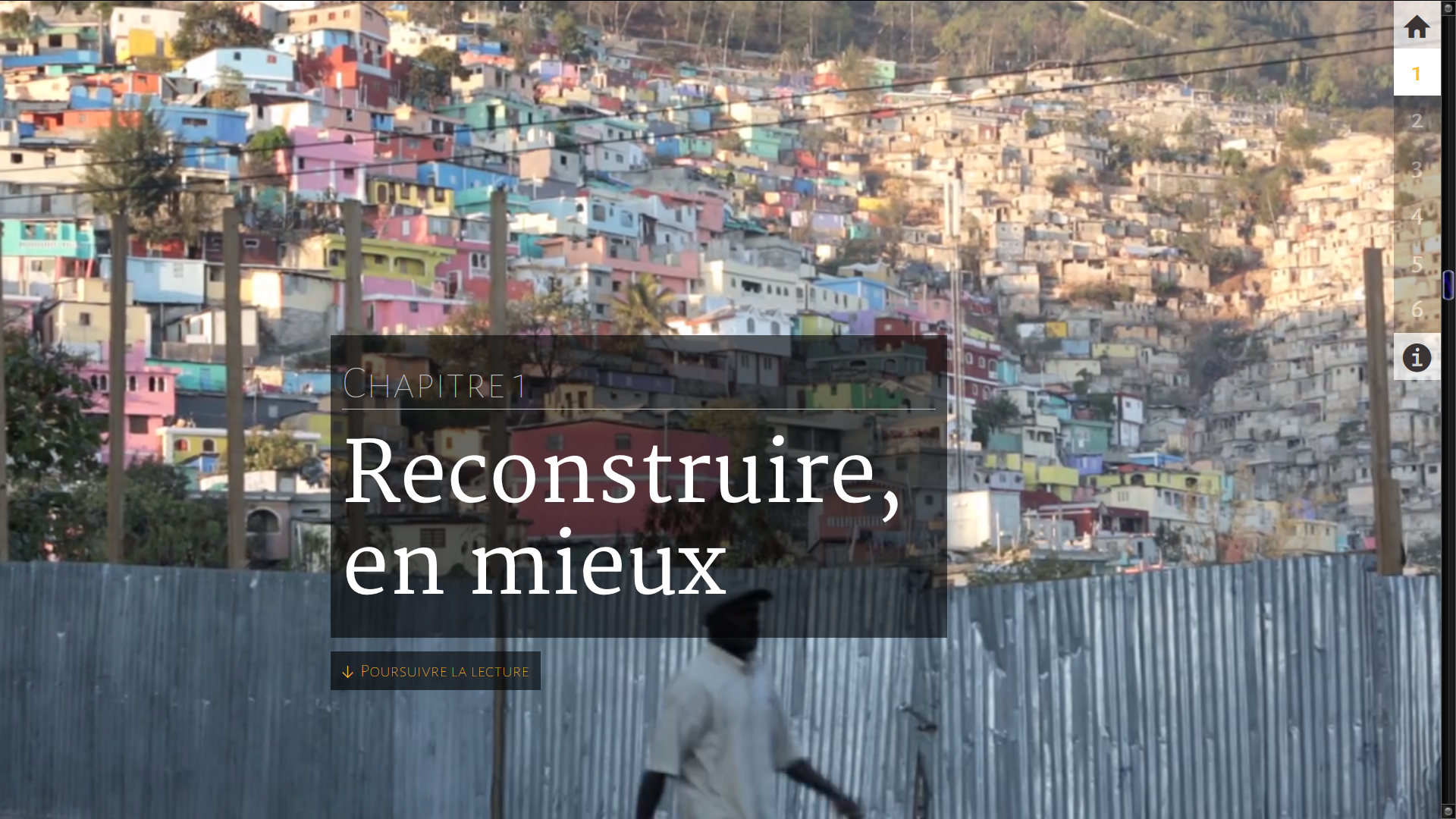
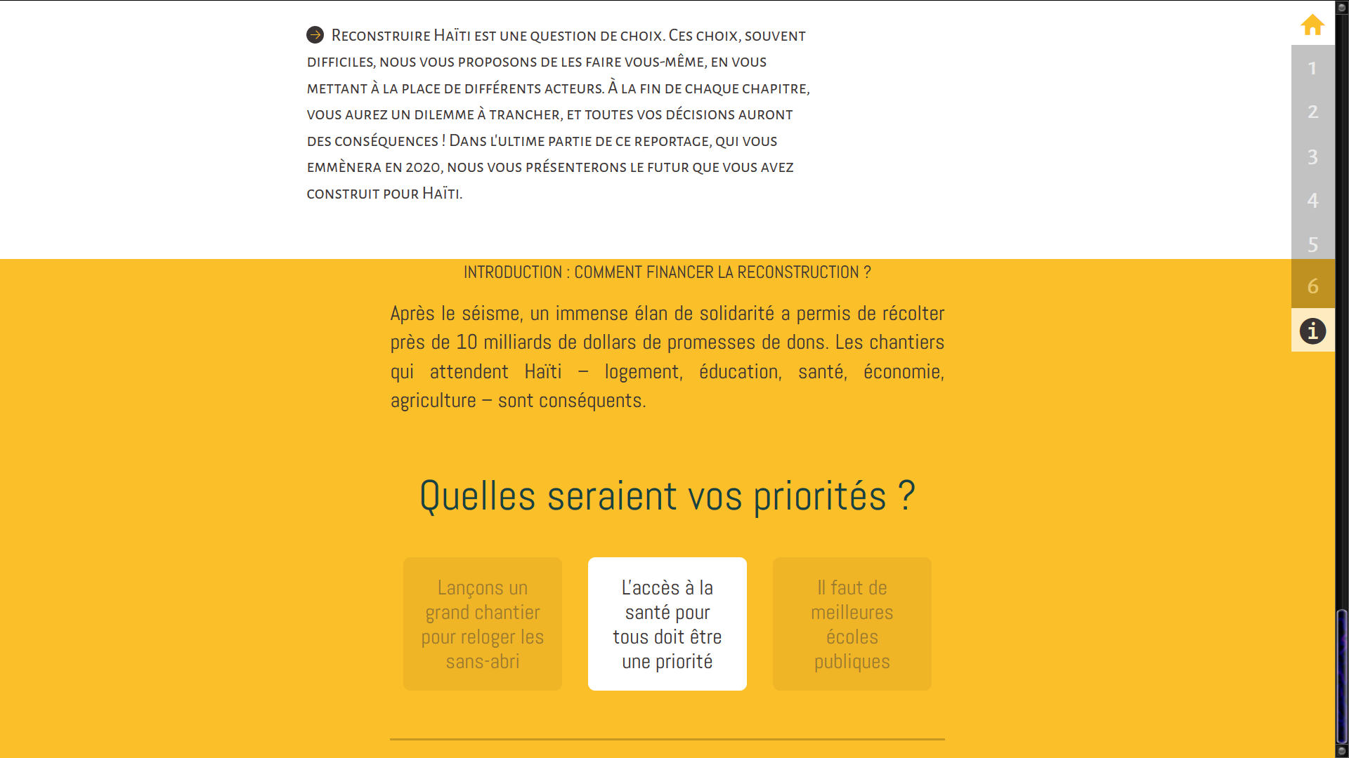
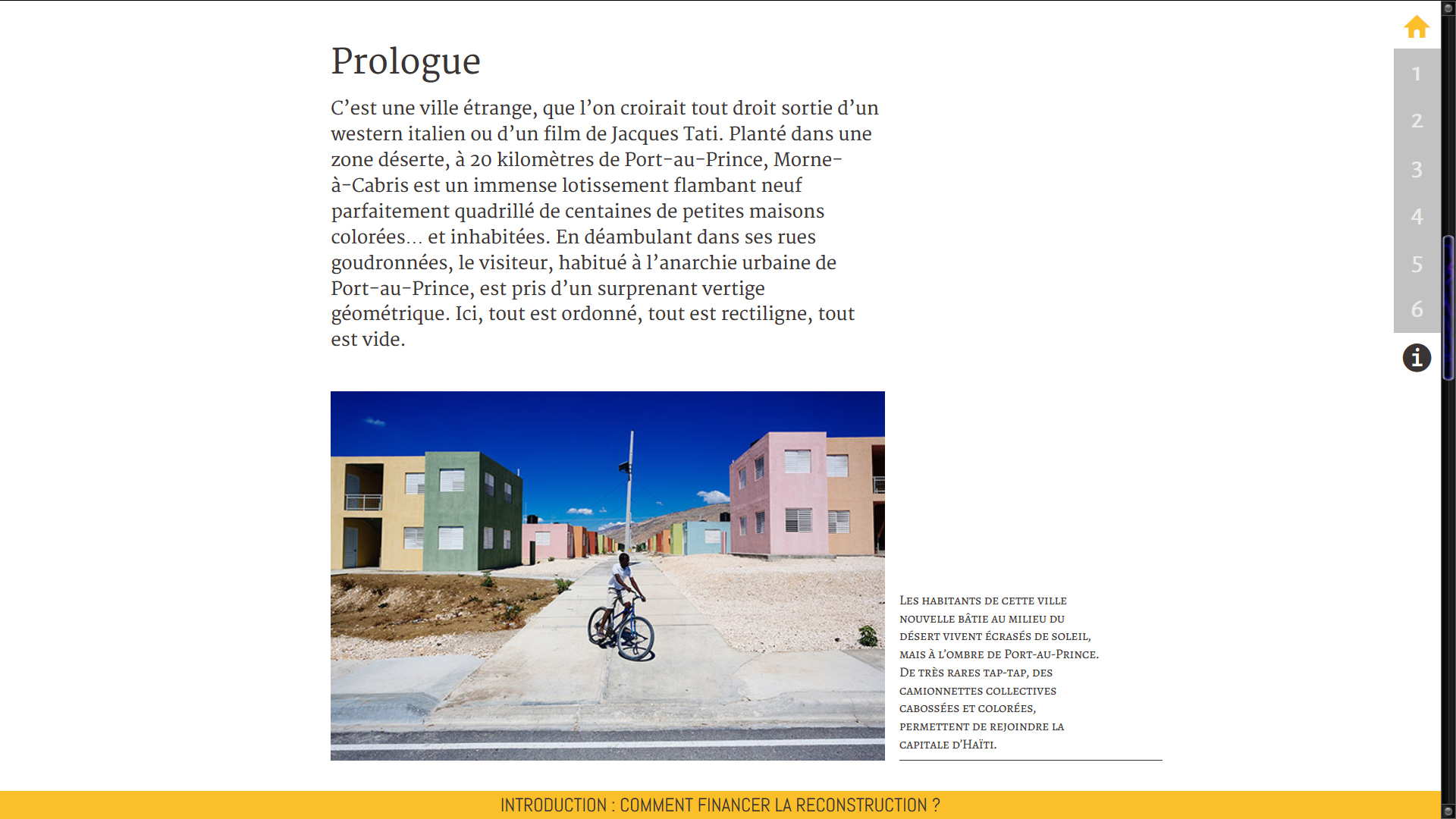


 Have you ever heard the claim that reality is boring? Video games lovers often say that to explain why they love virtual worlds – and incidentally why the real world doesn’t make a good basis for a compelling game narrative. For nearly 50 years now, we’ve been fighting lots of trolls, rescuing plenty of princesses, piloting space crafts and recovering from heavy fire by crouching behind walls. And to be clear, I have absolutely no problem whatsoever with that – in fact, I enjoy it very much. I understand that video games rapidly structured as an industry with a focus on entertainment. We may want to play to escape from our everyday routine, to empty our heads a bit, and those are perfectly fine motivations. Simply, there’s no reason they would be the only ones.